American artist Colin Snapp uses his work to reflect upon a cultural fascination with image that haunts the very structures of our lives. In film, photography, sculpture, and installation, Snapp captures the architectures, such as tour buses and brands, that mediate and reduce our lived experience to a series of static images. In recent projects such as the video NV Regional (2013) and the photographic series “National Charter,” Snapp has explored the strange meeting point of authoritative order with natural beauty. Snapp speaks with NYAQ’s Nicole Kaack on the event of his concurrent exhibitions at Galerie Allen and FIAC in Paris.
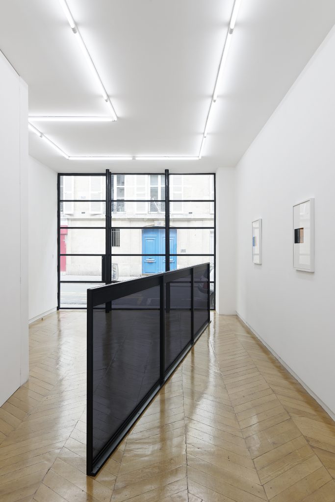
Colin Snapp, Delta, 22nd September, 2016 — 29th October, 2016, Galerie Allen. Photo: Aurélien Mole
Nicole Kaack: “Delta” can signify many things. It is the mathematical symbol for change, but it is also the term we use to describe that sedimentary no-man’s-land at the mouth of a river as it turns into several. Why did you choose this name for your exhibition at Galerie Allen?
Colin Snapp: I decided to title this exhibition “Delta” for several reasons. I was first exposed to the word while flying with the American airline Delta, so I’ve always associated it with air travel rather than a mathematical or geographical reference. I’ve always been interested in typography as well as the subtleties of visual marketing, specifically corporate logos. Much of my work acts to re-frame the notion of what a logo stands for and how the imagery of what a brand represents is constantly in flux. The Delta Airlines insignia is a logo that I’ve always been attracted to. Additionally, I like the non-specificity of the word Delta. For one person it can bring to mind geometry—specifically, a triangle in the Greek sense—for others perhaps fraternity culture or the ending point to a river. The title Delta doesn’t directly address any specific work in the show but, in an indirect way, alludes to all the works. For me there is certain poetry with the title as it leaves space for interpretation yet simultaneously speaks of my interest in modern travel, geography and the nature of branding.
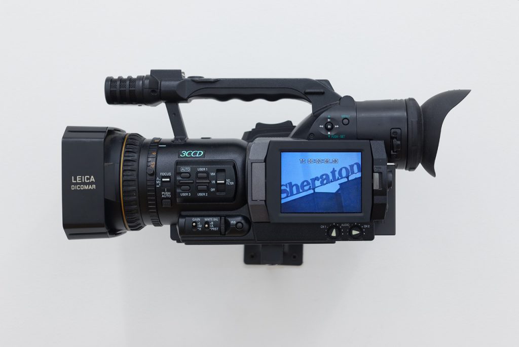
Colin Snapp, Sheraton, 2016. Video and digital video camera, 19 x 37 x 22 cm / duration 60 mins. Photo: Aurélien Mole. Courtesy the artist and Galerie Allen, Paris
Your title sort of preempted my desire for profundity in a word, a single serving of eloquence. I love that your experience of the word “Delta” is both the capitalist dream and the defeat of the intent behind the branding. In a kind of circular reasoning, they name the company “Delta” to suggest that what they sell is both pure and natural, but when your first experience of the word is as this consumer experience, the intent is somewhat reduced. This is not to say, of course, that those words have been voided of the classical connotations. Maybe that is part of it: producing a non-word that nonetheless holds multiple meanings. Would you say that, in this manner, the title is almost a filter for the entire show?
Yes, I agree with you completely. I’m quite intrigued by the fact that a word that represents a corporation often becomes more powerful than the definition of the word itself. Also, it’s important for me to give a somewhat ambiguous title to an exhibition that, by its nature, is quite conceptual. The thought of using a title as a crutch to express the full idea of an artwork has never appealed to me.
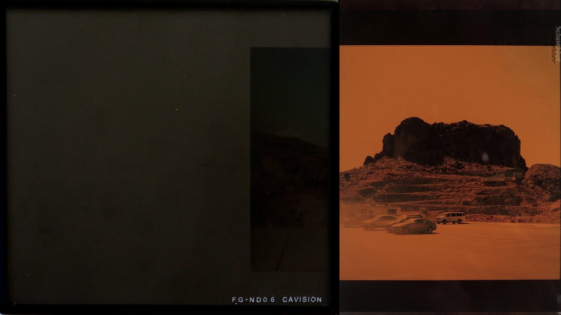
There is a certain kind of loneliness to the way that you photograph nature in the IRND series. I think this emerges from the sepia tones of the IRND filter, which draws ties between the images you choose to capture and shots taken by early travel photographers like Félix Teynard or Gustave Le Gray.
The IRND series came about as somewhat of an accident. While filming a video in Nevada, several of these filters broke due to the wind. It became obvious to me that I needed to make use of these “artifacts of production.” Initially I thought to frame just the fractured filter but after some time I realized it was more interesting to create assemblage works with these filters. In turn, the series has become a way for me to portray not only elements of my filmmaking process but also address the larger frame work of my practice.
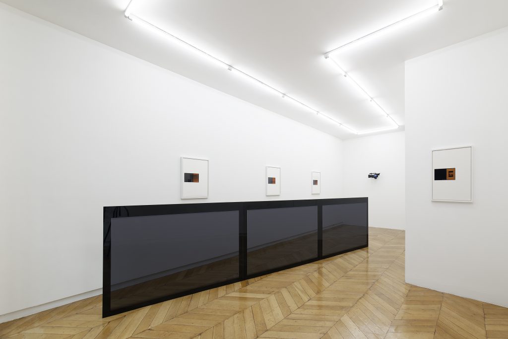
Colin Snapp, Delta, 2016. Charter bus windows, tint, and powder coated steel, 456 x 111 x 5.5 cm. Photo: Aurélien Mole. Courtesy the artist and Galerie Allen, Paris
Transparency, as a technique of literalizing an already-mediated gaze, is present throughout your work. Your images of tourists in parks demonstrate a cultural enthusiasm for the image on the screen that exceeds interest in the reality on the other side. Would you speak about this in relation to the new window sculptures and IRND prints presented in Delta?
The infrastructure of travel contains divisions that dictate perspective as well as experience in a general sense. For instance, if one person is a passenger on a bus or plane looking through a window with a cyan tint they are going to interpret their surroundings in a different manner than a passenger who views these same surroundings through a window with a yellow tint. The IRND series act to address this phenomenon in the simplest of forms as they show a single landscape photograph through two different fields of color. The charter bus window sculpture is similar in terms of creating a piece that confronts these notions of perception yet it varies in the sense that it also acts as a barrier and form of constraint. The basic principle I’m addressing with this sculpture is that a person can exist within a location or culture but not actually engage within it. It’s a piece that originated out of a Leica Toll, a film I made in North Africa where I spent a month living within packaged tour groups. The majority of my time was spent witnessing the countryside from the contained perspective of bus windows. I shot the entire film from this limited vantage point.
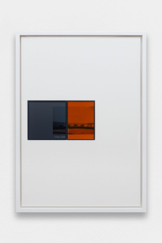
Colin Snapp, IRND Platinium/Amber/2, 2016. Infared ND lens filters, 35mm konica print. Image: 65 x 47 cm. Photo: Aurélien Mole. Courtesy the artist and Galerie Allen, Paris
You also choose to distance or dwarf the image further by placing it in a much larger canvas. Can you talk about that compositional decision?
The choice to place a small object in a large frame is a way for me to draw attention to the filters. I prefer to think of these filter assemblages as historic artifacts. Artifacts derived from a personal experience yet presented almost as though they are sacred objects in a vitrine. The compositional decisions as well as the framing are influenced by these notions.
That is interesting. I definitely see the vitrine space, in the sense of presenting an object as testament to narrative, but also in the form. The way you isolate the assemblages in an expanse recalls the way such articles are presented in museums. The move from horizontal to vertical is also important though, because as viewers we have to look forward, outward, towards the object. It is the reorientation from the working object plane to the perceptual, lived one. In thinking about experience in this way, framing it for us to look at, what do you hope to bring to your viewer? Do you have an agenda or do you hope for a freer response?
I like what you’re getting from these works. It’s definitely in line with what I was after. However, there is no specific agenda with the presentation. Rather the framing and installation decisions are the results of studying many framing methods throughout the years and then inventing new ways to incorporate a more traditional technique. Devising a new framing style to best articulate each series is important to me. I had the frames for these assemblages constructed in the manner that I felt was best suited for these exact filters and their relationship to the bus windows and gallery space as a whole.
Can you speak further about the FIAC Tour Bus project? Much of your work seems to deal with the mythology of “coming back to nature,” and your travel projects have wandered the United States’ countryside. For this project you are twice divorced from regular subject matter, displaced to France’s urban environment. How does this different structure change the intentions of the project?
That’s a really good question. As an American it has always felt natural for me to make work about America—it’s what I know. I believe the subject matter of my native country is something I can work with in a more honest way than that of a region I don’t have roots in. That being said, I’ve always been attracted to the idea of exhibiting in a context foreign from or distant to that in which the work was constructed. Charter buses and tour groups in general are fairly ubiquitous throughout the world. Meaning that, in this instance and for this specific installation, the context isn’t so important. Paris is essentially the modern capital of tourism, so, in a way, it’s a perfect project for the Tuileries Gardens, which are central to the most visited sites in the city. Yet, in another sense, the fact that the bus will exist out of its routine environment and within the confines of a garden is quite interesting to me. It’s possibly the perfect fit, albeit not specifically American and not specifically addressing a national park but still removed from a comfortable zone. This form of re-contextualization is what feels important; whether performed in Europe or America is beside the point.
