Asymmetrical Response: Cory Arcangel and Olia Lialina
Western Front
202 East 6th Ave. Vancouver BC, V5T 1S1
September 9–October 22, 2016
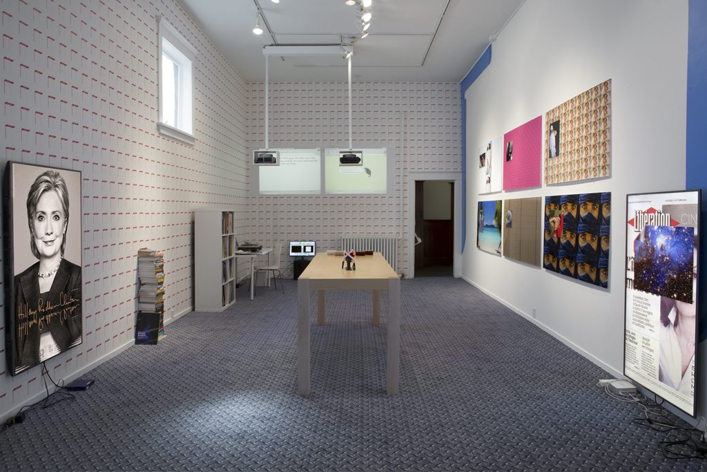
When I look at the work in Asymmetrical Responses, a decade-long collaboration between Net-Art pioneers Olia Lialina and Cory Arcangel, I am trying to find the people between the users and the interfaces. Between works displayed on cellphones or vintage game consoles, books, flat screens, projections, gifs, slide projects, a custom carpet job, wallpaper, a sculpture here and there, a few items from each artists’ clothing line, and a single repeated verse from a generic pop song fading in and out of the exhibition space, I do not feel particularly set-up to pay close attention to anything.
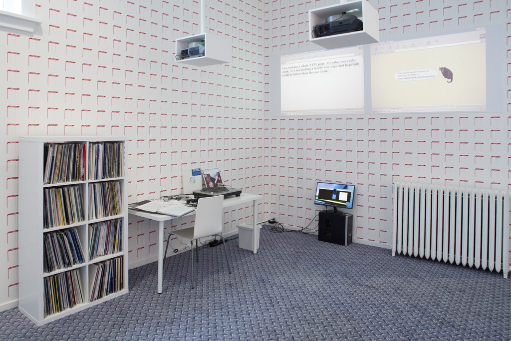
Cory Arcangel and Olia Lialina, Asymmetrical Response (installation view), Western Front, 2016. Photo by Maegan Hill-Carroll.
I sat at a desk where a pair of white gloves and turntables are set up next to a shelf that contains The AUDMCRS Underground Dance Music Collection of Recorded Sound (2011), a catalogued and rated collection of over eight hundred techno and trance records that Arcangel purchased from retired DJ Joshua Ryan.[1] Sitting just beyond the shelf, Lialina’s Bringing your talent to the web (2009-ongoing) is a stack of books with their spines facing out. This literature shares the same path of obsolescence as its subject matter. As a readymade sculpture, it’s quite wry— like an amateur comedian that gets up on stage and asks, So, reading books about the Internet, what’s up with that?
Looming over this area is Give me time/This page is no more (2015), a diptych formed by two slide projections cycling through pairings of newly (at the time) established and abandoned Geocities webpages brandishing the standard sheepishness of the early web: sorry-nothing-to-see-come-back-later, this-page-has-moved, or, my personal favorite, I-have-a-life-now. This album of false starts and desertion-en-masse presents a casual yet unsettling phenomenon where people attempted to carve out some autonomy for themselves in the form of a web page. Then beside it, the subsequent evacuation of desire from this space. The creation of this work directs our attention to an erasure, which opens up the capitalistic dimension when amateur webpages began to be phased out by a spick-and-span Web 2.0. Lialina has written extensively about the narrowing of our agency on the web and the limitations imposed on users as Web 2.0 took over (as evidenced also by the Yahoo templates that she has appropriated for her wallpaper pieces in this exhibition): [2]
“Search engine rating mechanisms rank the old amateur pages so low they’re almost invisible and institutions don’t collect or promote them with the same passion as they pursue net art or web design. Also new amateur pages don’t appear at such amounts as ten years ago because the WWW of today is a developed and highly regulated space”.[3]
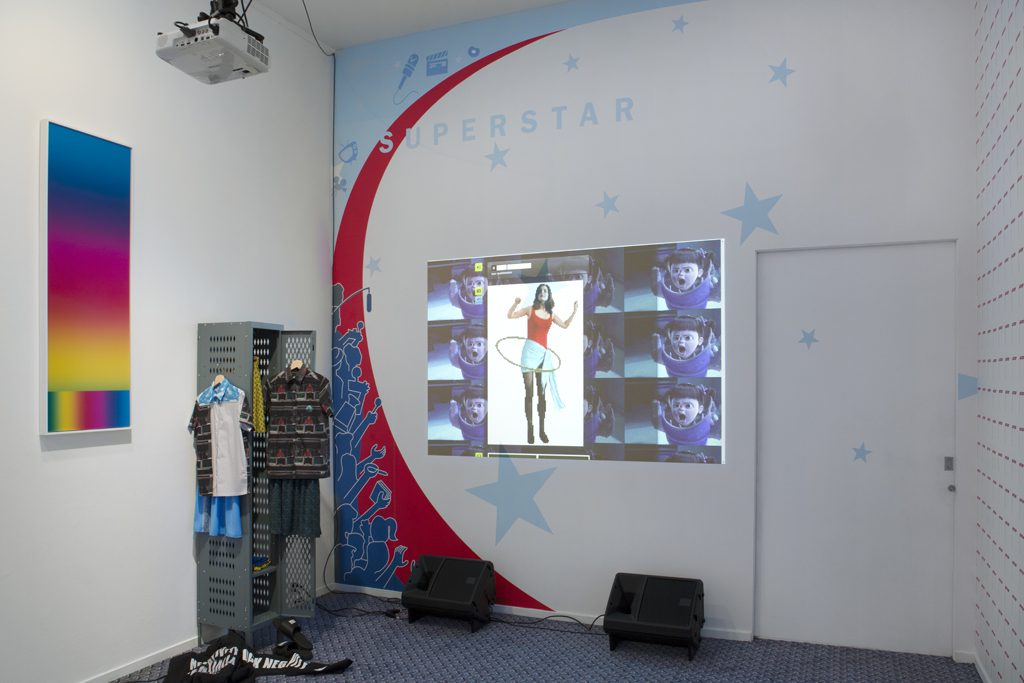
Cory Arcangel and Olia Lialina, Asymmetrical Response (installation view), Western Front, 2016. Photo by Maegan Hill-Carroll.
These works speak to archival occupations by larger initiatives to sustain access or reference to outmoded software, content, and documented behaviors on the web. This type of endeavour is conducted by non-profit groups like Internet Archive and Archive Team who in 2009 downloaded a terabyte of Geocities webpages before they were permanently deleted from their servers, which made Lialina’s work possible. Give me time… is well situated in dialogue with AUDMCRS because Arcangel has spoken of the work as a way to preserve the collection through the institutional handling of artworks: “I’m hoping that since the collection is now going to be treated as an “art object” it might give it a good chance of being treated properly in the long run—kind of like appropriation as a form of preservation. And the website I thought of more as an advertisement for the collection as well as an homage to those classic early net “collection” websites…People used to make beautiful handmade websites of IRL collections: “Welcome to Chrissie’s Beanie Baby Corner,” etc…it’s trying to preserve that kind of thing as well.” [4]
Lialina’s MeetMyDog, PersonalPageBlue, and CelebrityBckgd3 (all 2016) appropriate early imagery that Yahoo offered its users to personalize their profiles and content. MeetMyDog is a simple red frame that would have been used to frame a picture of one’s pet. Reproduced at roughly the same size as how it would have been displayed on the screen, this motif is tiled on one wall, while the other generic templates are blown up to architectural proportions. Does this locate us, the viewer in the screen, or is this a translation of a digital expression into a tangible encounter (giphy.gif)? The literal interpretation of a cyber-ornament also informs Arcangel’s custom carpet job in the gallery. He takes the oft-computer-generated pattern—diamond plate, based on the industrial steel texture used in factories and construction sites as non-slip walking surface—as if to say, don’t slip. Diamond plate is just one example of a digital texture that could be applied as a tiled background or wallpaper for a website.
Cory Arcangel’s er…”sculpture” Frozen (2015) is a lackadaisical foam pool noodle that seems to stand in for a limp user-cum-consumer. From his collection of sculptures based on floatation devices (a play on words to describe someone who “surfs” the web?), Arcangel classifies Frozen as a “tween” sculpture. The demographic of “tween” doesn’t exactly flatter, nor does it evoke a nostalgia for youth. The tween is always and forever an embarrassing figure, but also technologically tethered and web-proficient. Propped against the wall, dressed with a single sock featuring Tommy from Nickelodeon’s Rugrats, an iPod Nano in arm holder and co-branded headphones blaring Idina Menzel “Let It Go” from Disney’s animated blockbuster, Frozen is the worst. Looking at each of its constituent elements reproduces the aggravation that understandably overcomes you when a gaggle of “tweens” enter a room or board a bus. As a blunt and basic assemblage of elements deployed to détourn popular culture, (and perhaps this is a minor or insignificant detail) the operatic motivational pop track can be heard expelled from the over-ear headphones from almost every spot in the exhibition. Sensorial antagonism aside, curatorial or not, the volume of this work is in cohort with the general saturation of this exhibition, which at this point is feeling more like, don’t drown—here’s a pool noodle though.
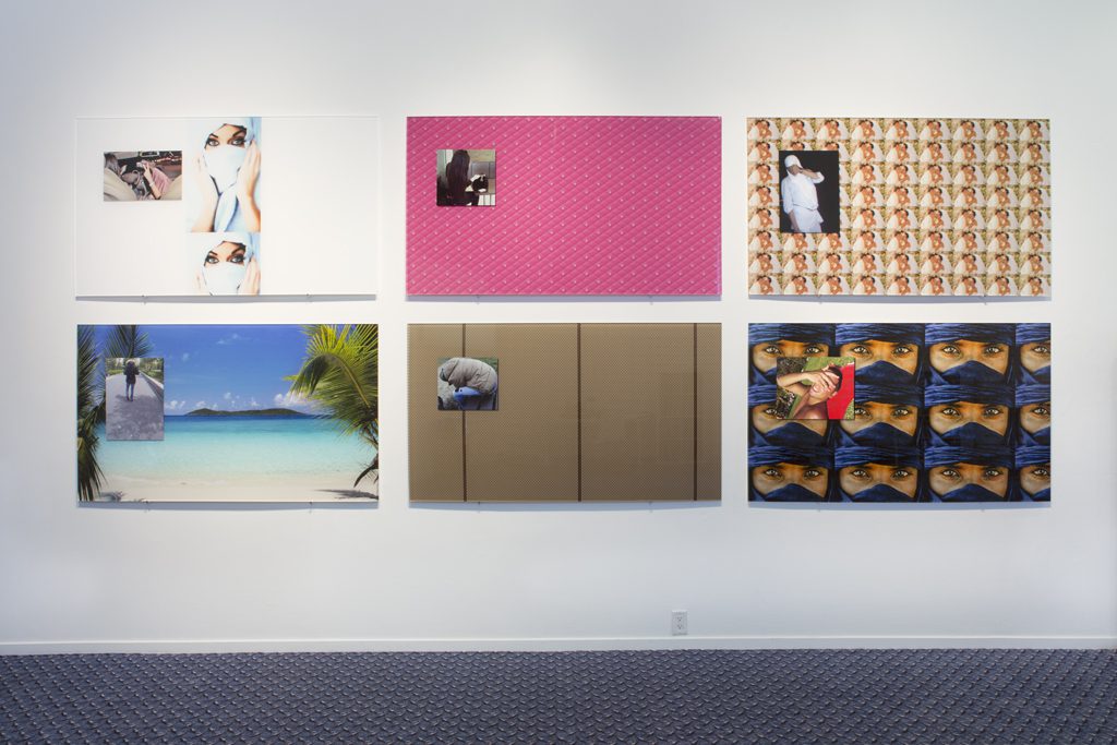
Olia Lialina, Body Class Pimp (from left to right: voelmegoed, damlos, naoualtje89, halim71, gekregen2012, henessy), digital prints mounted to plexiglass, Western Front, 2016. Photo by Maegan Hill‐Carroll.
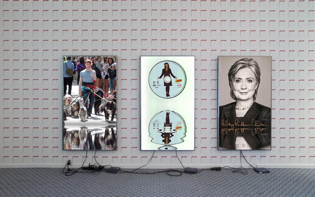
In a 2013 review of Arcangel’s work at DHC/ART (Montreal), his oeuvre is identified as part of a “depressive paradigm” where humour is a thin veil over cynical irony and dependency on monotonous gestures.[5] In this exhibition, it would appear that his sensibility has shifted with the arrival of a line of clothing and footwear bearing the slogan “FUCK NEGATIVITY”. Under this text is a water motif that distorts the text as if reflected in a pool of water. This motif is also applied to three adjacent works, Hillary/Lakes (2014), Seinfeld DVD/Lakes (2014) and Dawgs/Lakes, (2016) where three images—each on their own flat screen—are reflected in a rippling pond like contemporary deities in a mythic digital pool. “Fuck Negativity” is apparently a statement that should rebuke and shed the crutch of a pseudo-critical malaise, but at the same time, it doesn’t exactly manifest positivity in this context. The vernacular of these shirts and sandals seem to borrow from merchandise circulating on trendy streamlined shopping websites such as this, this, or perhaps this and these.
In the exhibition’s essay, the Internet is referred to as a “medium for expression.” Through coding and programming, the Internet becomes highly malleable to a select few, but it is ultimately shaped by its vessel. Like water, it conforms to the shape of its interface. To think of the Internet as a medium for “expression,” I can’t help but ascribe this agency more to the Net’s users and abusers than to works that cynically respond to the aesthetic of their digital escapades. Looking at art that reproduces the effect of indiscriminate browsing a million tabs at once may discomfit gallery viewers about their relationship to the Internet, but it doesn’t actualize a more radical, or rather a less passive, user.
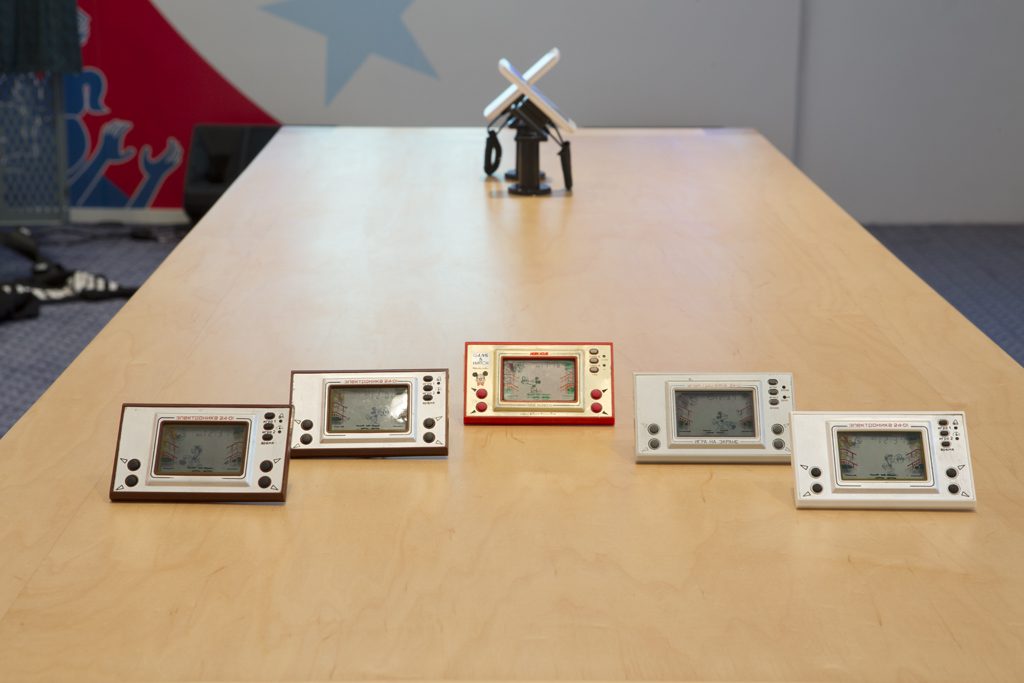
Olia Lialina, Liquid Crystal Curtain, one Game & Watch Nintendo hand held device, four Elektronika hand held devices, Western Front, 2016. Photo by Maegan Hill-‐Carroll.
In an interview conducted between the exhibition’s curator Caitlin Jones and media arts figure Michael Connor in 2005, they discuss the challenges in exhibiting art and the technology before, during, or after the Internet. In this interview that took place just over 10 years ago, it seems they are both grappling with how to meet the artists’ rationale, while creating conducive viewing conditions that bring associations and apprehensions to the artwork and vernacular technology that is its backdrop.[5] A commitment to spatial design and cultivating an intelligent public around new media art was present then, but here those intentions seem eclipsed, or nullified, by the preoccupation with showing how much worse things have gotten since the arrival of Web 2.0, how regimented our agency has become, and less caring we, the users, are for a meaningful digital culture.
In last decade, or even two, our main imperative and how we behave on the Internet hasn’t changed that much in regards to externalizing, expressing, ourselves. Like Lialina has said, what has changed are our options and languages given to do so. Despite the economic and ideological impositions made visible through some of these works, we are all, always using the Internet to express ourselves—the episodic spats on social media, theme gardens, coding classes—our screen time is really just an ongoing workshop and auto-romance with versions of ourselves we hope or imagine ourselves to be. The intimate nature of the user-screen interface and the ostensibly potential connectivity amounts to an engagement that is equal parts narcissism and anthropology. And though, it’s all about us, and our cultural imprint on the World Wide Web—with a hint of self-loathing, I began identifying more closely with a Luddite by the time I took my leave.
Cory Arcangel and Olia Lialina, Asymmetrical Response (installation view), Western Front, 2016. Photo by Maegan Hill-Carroll.
—
[1] Whenever this work is shown, a set is commissioned by the institution to a local DJ and performed before an audience.
[2] “Web 2.0,” a term used to describe the increasing use of centralized services rather than independent websites to share and access content online.” Michael Connor, “What’s Postinternet Got to do with Net Art?” rhizome.com http://rhizome.org/editorial/2013/nov/01/postinternet/
[3] Olia Lialina “A Vernacular Web: The Indigenous and The Barbarians” <http://art.teleportacia.org/observation/vernacular/>
[4] “A public archive of 839 trance and underground LPs” Cory Arcangel. Interviewed by Lauren Cornell. First Look: New Art Online. November 5, 2013. New Museum. http://www.newmuseum.org/exhibitions/view/the-audmcrs-underground-dance-music-collection-of-recorded-sound
[6] Michael Connor. Interviewed by Caitlin Jones. 2005. Electronic Arts Intermix: Resource Guide for Exhibiting, Collecting & Preserving Media Art <http://www.eai.org/webPage.htm?id=1143>
