If you’re like me, flipping through the pages of “Architectural Digest,” a magazine devoted to contemporary home design, is bound to cause a full range of feelings: desire (I want to go to there.), resentment (They’re not better than me.), inspiration (My home would also look great with turquoise walls!) and discomfort (Where do they put all their stuff?). Interiors featured in this glossy rag are often presented like miniature museums of taste where the distinctions between art and décor are confounded, made secondary to the overall design scheme. The artists in “Architecture Undigested,” Jessica Silverman’s most recent curatorial project for Fused Space, use elements of interior design as a starting point for their work, taking chunks of larger architectural spaces and makes them bite-sized, palatable as painterly sculptures, sculptural paintings or dadaist reconfigurations.
The exhibition title, a riff on the home design magazine, implies that in contrast to the glossy pages of “Architectural Digest,” the work has not been tidied up into a neat domestic package. Instead the work seems detached, lacking specificity or a sense of place.
A few themes emerge, the most notable is a repurposing of industrial tools and materials. Removed of their original context, the materials lend the works a surrealist tone. Marte Eknæs’ “Better furnished, more fortunate III,” an industrial-grade door sweep installed on a gallery wall six inches off the floor, drew me in with its subtle humor. This Duchampian gesture reminded me of Robert Gober’s piece, “Untitled (leg),” a life-like replica of the artist’s leg coming out of the gallery wall. Both works depict parts displaced from their whole, giving them a quality of uselessness and vulnerability. The door sweep’s plastic bristles point outward towards the room, asking us to engage, to give it a new purpose.
Eknæs’ second piece, “Anti-slip,” consists of three neon orange pieces of slip guard outside the gallery doors. You aren’t immediately aware that you are looking at an artistic intervention until you notice the odd placement and unusually bright color of the material. In fact, the pieces were so covert that I missed them completely during my first visit to the gallery. You might consider that a success, or not, depending on your artistic leanings.
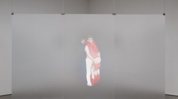
Another theme in the show is that of painterly abstraction as depicted through pseudo-sculptural means. Stephen Prina paints brushy color fields on floor-to-ceiling window blinds for his piece “Blind No. 16, Fifteen-foot ceiling or lower, (Cadmium Red Medium Hue/Anthraquinone Blue/Primary Yellow/Hansa Yellow Light).” Brian O’Connell and Mitzi Pederson engage the spatial constraints of painting, in both material and depth of field, using cement and concrete. Brian O’Connell’s pieces “Untitled #14” and “Untitled #20” are geometric abstractions made of rapid set cement and wood, scaled like a portrait painting and hung on the wall. Cement has been scraped across the wood frame in a horizontal motion creating a pattern of stripes divided by ridges of excess cement. The cement oozes out in satisfying globs, like icing on a cake. The wood has buckled under the weight of the cement causing the surface to bow out towards the viewer at different angles. In parts, the wood has forced its way through the cement to reveal a soft, organic underbelly. The stylish combination of cement and abstraction mimics the industrial-chic architecture found in liberal havens like the Berkeley Art Museum or converted loft spaces in Williamsburg. This association further conflates the work’s relationship to decoration and interior design.

Stephen Prina
Blind No. 16, Fifteen-foot ceiling or lower, (Cadmium Red Medium Hue/Anthraquinone Blue/Primary Yellow/Hansa Yellow Light), 2011
3 panels: acrylic on linen, window blind mechanism.
Courtesy of the gallery.
Pederson’s “Untitled,” is an arrangement of concrete shards laid on the ground in a rectangular formation – reference to the restrictions of the canvas. The broken edges of each piece of concrete reveal a sparkly core of black glitter. The gray and black shapes create various compositions that shift as the viewer moves around the piece like a three-dimensional cubist painting.
Remarkably, in a city obsessed with naturalism, hand-blown glass and reclaimed wood, the artists in the exhibition have completely rejected the natural world, favoring the man-made above all else. The overall tone isn’t anti-nature, but rather a reflection of the geometries and materials of urban dwelling. Petros Moris’ three panels “Commons 2, 3 and 4” seem to be the remains of ancient mosaics or are perhaps all part of one large mosaic mural. The viewer is left to decipher clues of the original pictures: a bird’s talons, arcs of a wing or a wave. But ultimately the imagery is less important than the overall sense of strangeness and decay they convey, like props in a dystopian sci-fi movie like “The Man Who Fell to Earth” or “12 Monkeys.”

Petros Moris
Commons02, 2013, Commons03, 2013, Commons05, 2013
unglazed fired ceramic tiles, extruded polystyrene rigid foam construction panels coated with synthetic polymer plaster and reinforced with glass-fibre.
Courtesy of the gallery.
The show’s only other natural motif appears in Ruairiadh O’Connell’s screen prints of a Las Vegas hotel carpets. “Bellagio” depicts the floral motif printed over a garish, burnt orange wax. The other two wax panels “New York, New York” and “Paris” depict carpet patterns from their respective hotels on the Vegas strip. O’Connell’s works highlight the ways each hotel defines its identity and relationship to its namesake city through its carpet pattern. “Paris” displays an orderly black and white, art nouveau motif with palm fronds and fleur de lys. Meanwhile “New York, New York”’s carpet is a jazzy mish mash of art deco iconography like the Chrysler Building and gratuitous floating shapes.
One of the exhibition’s strengths is the way that it mimics the cold materials and muted-palette of the upper class apartments found in magazines like Architectural Digest. While there are bright pops of color here and there, they appear like spots of color in a late Mondrian painting: self-contained and isolated amongst the hard-edge geometry. The materials in the show- cement, marble, stainless steel floor guards and window blinds- are all familiar, yet lacking the warmth one expects from their home decor connotations. Perhaps this speaks to the coldness of contemporary architecture or to the state of contemporary art.
“Architecture Undigested” is on view through January 15th, 2013.
For more information about the show visit Fused Space, San Francisco.
-Contributed by Sarah Thibault.


