Gary Garrels is the Elise S. Haas Senior Curator of Painting and Sculpture at the San Francisco Museum of Modern Art, and along with Rudolf Frieling, one of the originating curators of Bruce Conner: It’s All True. Although Conner was a protean producer across a number of media—notably film, assemblage and photography—and although he is increasingly acknowledged as one of the Bay Area’s most significant artists, this is only the second major monographic exhibition of his work and the first to be shown in San Francisco, his adopted hometown. On the eve of the show’s opening at SFMOMA, I spoke with Gary via telephone in order to discuss the critical reception of It’s All True at New York’s MoMA, and the role this exhibition could play in defining Conner’s importance, as well as to understand better some of the reasons why Conner matters, and why he is only now—eight years after his death in 2008—receiving his due.
I haven’t seen the exhibition at MoMA and I don’t know enough about Bruce Conner, so I guess the biggest surprise for me, at least, is to see him through this show, Bruce Conner: It’s All True, emerging on the scene with a bang after many years of being fairly quiet in terms of his presence in the art world. People I’ve been talking to say that they were aware of his films for a while, but they’ve also been surprised, if pleased, by his recent ascent into visibility. I was equally surprised, but really pleased, to see him in my curatorial practice students’ Void California show earlier this year through their inclusion of the seminal punk zine Search and Destroy, to which he contributed, and one of his punk documentaries, which was curated into the exhibition programming by Craig Baldwin. He also cropped up in the Jay DeFeo retrospective as the maker of the film, The White Rose, but he hasn’t tended to crop up in general, has he? Or has he, and I’ve just missed it?
I think your description is exactly right. There’s been little bits and pieces of Bruce around, but nobody really had much more than a fragmented sense of his work or career.
In fact this show is his first comprehensive retrospective, but he’s being billed as a major American artist. When, and how, did he become major?
The Walker organized a very large survey of his work in 1999 called 2000 BC: THE BRUCE CONNER STORY PART II. Bruce actually had a typology of what he saw as his retrospective, which was basically an exhibition in seven sections, each one addressing a particular body of work or works. He very consciously did not include several bodies of work in that exhibition. The show came to the de Young in 2000, and then went to MOCA in Los Angeles, before heading to Fort Worth, but there was no interest on the East Coast at that time. I think it brought the work to a lot of people’s attention and was visited by quite a few people, but it still didn’t really break through in a—
Significant way.
And then there was a show organized by the Kunsthalle in Vienna, in 2010, that looked specifically at his ’70s work, and that traveled to the Kunsthalle in Zurich, which got Bruce a bit more on people’s radars in Europe.
So there’s been a bit of activity, but what about the more cynical view, which I’m sure you’ve had to contend with, that Bruce Conner’s emergence has to do with the market, and the need to find new artists to promote and sell.
I have to say, I don’t think it was so much the market looking for material as it was that the market began to realize that scholars, art historians, and curators were really getting very interested in Conner and what he contributed, and they in turn realized that here was a very good, interesting, important artist who hadn’t been fully embraced. Michael Kohn in Los Angeles has been showing Bruce since the late ’80s, and he had a presence at Susan Inglett Gallery in New York for many years, but she was dealing primarily in works on paper. So, again, he didn’t have a major presence in New York, which is really where the market is definitely centered. Paula Cooper Gallery took on his estate about three or four years ago. And of course, he was represented in San Francisco by Paule Anglim for many, many years. It’s really been a swelling up of interest on the part of art historians and curators who have been taking Bruce more fully into account, and certainly since his death in 2008.
Right. The catalog, which I want to talk about more in a minute, positions him very much as an inspiration to artists, so there is this sort of notion that they have maintained his legacy, particularly someone like David Byrne who apparently saw Conner’s films just after he made them in the early ’70s. But then you have someone like Dara Birnbaum who says that she never met him, nor does she remember discussing his work with her peers, and she wonders why Conner’s name “had not crossed our lips, nor even entered into our conversation over drinks?” Do you think that this makes the argument that he became somewhat marginalized by relocating to the West Coast?
I think that’s true. I mean, he basically spent most of his life, most of his career here in San Francisco. He decided very early on, in the mid ’50s, that he did not want to be based in New York. He also always had a very intense ambivalence about the art world. There’s a strongly individualistic, even anarchistic kind of underpinning to all his work. I mean, he undermined his “career.” He canceled museum shows, he had difficult relationships generally with galleries. He didn’t want to play by the rules and be an artist in the “system.”
Yeah, I got that, very, very clearly when I was researching him. At the same time I was as confused, as I’m sure a lot of people were, by this. He moves away to get off the art world’s radar, but then he’s annoyed when the art world ignores him! You just think, well, this is difficult for everyone really. I noted a few instances in the catalog, but I’m sure there are more, where he talked about giving up: he gave up assemblages because they became too popular, he despaired in 1967, he contemplated withdrawing from the art world in 1976, made a work titled LAST DRAWING, and then in 1999 he effectively did withdraw, although I think I understood that he actually was still working, but in an anonymous way.
He completely denied having his authorship related to work by “artists” with other names: Anonymouse, Anonymous, Emily Feather, Justin Case, and so on. He really treated that very seriously and sort of squarely, that those artists existed in their own right. What he was willing to do, after his retirement, and using his own name, was to rework works that he had already made. So he did continue to produce work, but only reworkings of earlier works that were attributed to him, nothing “new.”
So Anonymouse, etc., were nothing to do with him? They were not personas. I thought I read his wife, his widow, saying somewhere that it was him, but I might have misunderstood that. I was going to ask you whether that was a conceptual gesture.
Well, I would say yes, but Bruce never talked about those artists’ work in that way. He always talked about them as independent artists.
When you say Bruce never talked about them in that way, it makes me think that you knew him personally?
No, I didn’t. I met him a couple of times, but only very briefly. I had no sustained interaction with him, so I really didn’t know him. I moved to New York in the fall of 1984, and I can’t remember whether it was that fall or maybe in the winter, but there was a gallery in New York called Phyllis Kind, she had been in Chicago as well, and she set up the film screening in her gallery—literally folding chairs and an old-fashioned kind of screen on a tripod—and showed some Bruce Conner films, and that’s where I first saw A MOVIE. And that was totally mind-blowing, it was just a crazy, wild, amazing film, and I had no idea about Bruce Conner, had never heard of him. I went to work at the Walker Art Center in 1991. One of my colleagues there was a man named Peter Boswell. Peter had written his dissertation on Bruce and was involved in an aborted retrospective of his work at MOCA in the ’80s. He was the museum curator who had maintained the most consistent relationship with Bruce over a long period of time, and through him I really got to know Bruce’s work. Peter was already then beginning to attempt to organize a retrospective at the Walker, which of course then didn’t happen until 1999. I was there from 1991 until the spring of ’93, and then I came out here to work at SFMOMA. Bruce Conner is such a major figure in the Bay Area that I became much more conscious of him. So for me becoming more aware of him as an artist was a long, gradual process, and it was really through the way my life developed that he came into my awareness.
That makes sense. It’s interesting that you should mention Phyllis Kind because she was a dealer primarily of outsider art, right?
Outsider art in Chicago.
One of the things that I’ve been wondering about with Conner, just visually, is the relationship some of the work bears to outsider art, especially some of the works on paper, some of the felt tip drawings, or the ink blots. These are classic tropes of outsider art, primarily the work made by people with developmental disabilities, if we think of the Prinzhorn Collection or some of the work that Creative Growth artists are making. I know I read somewhere that Conner hated the word obsession, but do you think that one of the reasons that he hasn’t been taken as seriously is that visually his work wasn’t really aligned with any of the schools that were on the radar of people at the time, and that it does seem a little more kind of “fringe” in a way? Or is that unfair?
Yeah, that could be part of it. I have to say, I’ve never considered Bruce’s art in the context of outsider art, but I can certainly see where one could make associations or see affinities. I think it’s also the breakdown, just in general, of the New York-centric narrative that’s been going on now for many years, but it just keeps deepening. For me when the Pompidou did the Magiciens de la Terre show in 1989, that was like the first full-blown assault on the standard New York-centric narrative, bringing in whatever you want to call it, folk art, outsider art, or artists who were not in the mainstream kind of paradigm. That has accelerated, you know, and here in this country, a growing awareness of postwar movements and artists in Latin America, South America, Asia, and India has gradually opened up the construction and narrative of art history. So I just see this as just one more element.
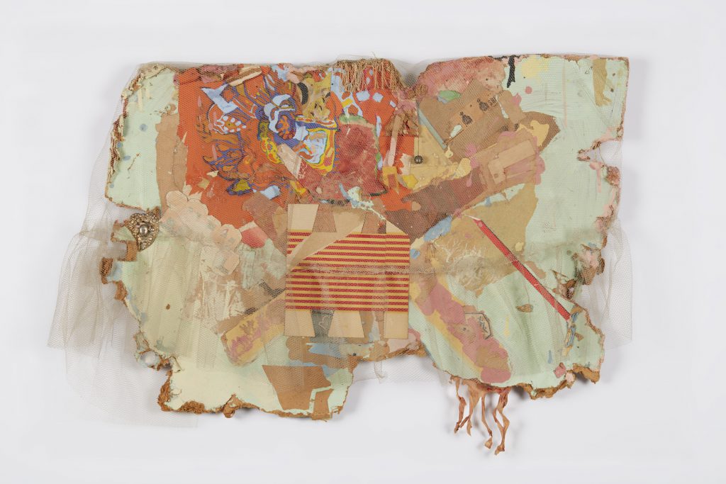
MEXICO COLLAGE, 1962; netting, paper, paint, ink stamps, fringe, bell, and costume jewelry on Masonite; 23 × 32 × 5 in. (58.4 × 81.3 × 12.7 cm); di Rosa Collection, Napa, California; © 2016 Conner Family Trust, San Francisco / Artists Rights Society (ARS), New York.
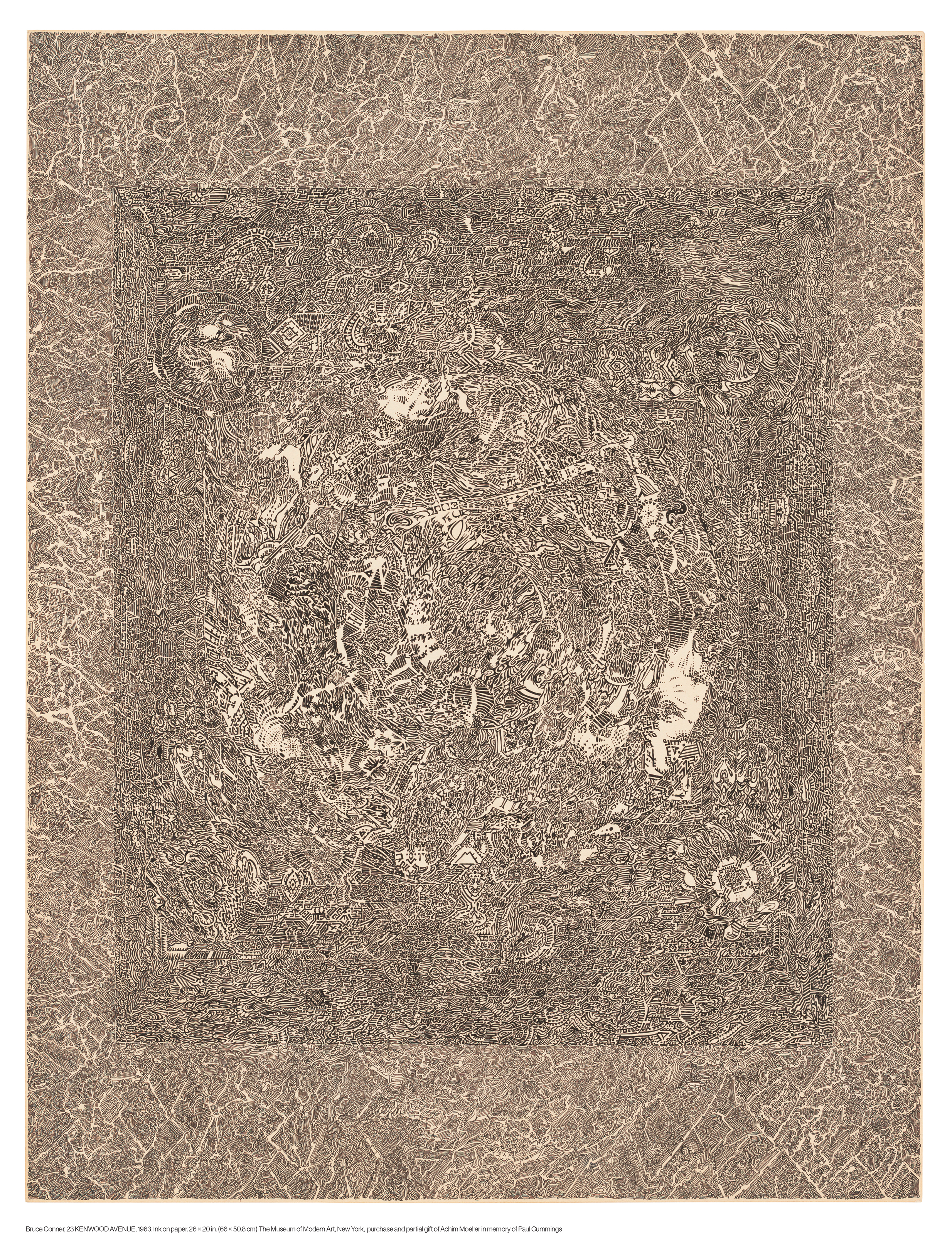
I have to say, when Rudolf Frieling—we have adjacent offices— one day asked, “Would you have any interest in a Bruce Conner retrospective?” I said “Yes, let’s talk!” That’s how it started at our end. But I also have to say that when I became head of the Prints and Drawings Department at MoMA in 2000, one of the first acquisitions I made there was of what I think still is one of Bruce’s most significant drawings called 23 KENWOOD AVENUE, which I think is the jumping off point for those ’60s drawings of mandalas and meanderings. There was only one small ink-blot drawing in MoMA’s collection up to that point, so for me it was really important to bring that work into their collection.
When did that initial conversation with Rudolf take place? How many years has this been in the making?
I’m thinking it was probably 2009, but I’m not absolutely sure about that.
You decided pretty early on to collaborate on the organization of the exhibition with curators Laura Hoptman and Stuart Comer at MoMA and to open the show in New York first. How will SFMOMA’s installation differ from MoMA’s?
The show in New York is a pretty straightforward classical presentation, and we are going to do something here which will be very immersive, it will be much more theatrical and experiential, with bodies of work much more sharply focused by theme.
That’s so interesting, because some people have said to me that they found the installation at MoMA hyper-sanitized.
It’s very MoMA.
Too white, too chronological.
Very clean. The walls are a uniform—if I recall it correctly—sort of light grey throughout. Our show is going to have a very different look and I think will give a very different experience of the work. We’ve met with Jean Conner and Bob Conway two or three different times about our intentions in terms of the presentation, and we’re still planning to look at it even more closely together with them.
I think that sounds great. I mean, that’s been most people’s main critique if they have one: they love the show, but they questioned the way that it was laid out.
But let me tell you, Bruce was deeply, deeply involved in the presentation of the survey show that the Walker did. And at the Walker it was super clean and clinical and sanitized, and very, very classical! That’s what Bruce wanted.
Well, I guess at that point that was kind of the flip side to what he was doing. He wanted museum recognition—
I think he did.
Whereas we want to experience Bruce Conner, because we never did, so we want the psychodrama. I read somewhere that the MoMA show, has around 250 works in 10 media. Are you showing the same works at SFMOMA or are you able to bring in different works?
We’re showing everything that’s there, except for maybe one or two drawings, but we’re going to add another 50 to 70 works.
So over 300 works? That’s huge!
It’s going to be a very dense show.
Fantastic. And how many of the works are SFMOMA’s? Is he really well represented in the collection?
He is really well represented. We have works from virtually every period and body of work. I will confess, the one thing that somehow slipped by the museum over the years is that we don’t have any of the engraving collages, but we are certainly working to remedy that. But otherwise, we have wonderful drawings. When I was here in the ’90s, I bought drawings. Early on in the ’60s and ’70s assemblages came into the collection. We have two of the photograms, the big ANGELS, I mean we have a very, very good collection here.
Yes, I’m sure. When was the last time that SFMOMA showed Conner and what was the exhibition?
Sandy Phillips did a show of the ANGELS, in 1992.
So almost 25 years later he’s coming back, that’s great.
That’s just that one body of work.
Yes, and it’s a great body of work (and one of my personal favorites). The reviews of the MoMA edition have all been super positive. There’s a quote I pulled out of The New York Times—I don’t think this was Roberta Smith, but it might have been—which says that, “partly by its very organization, [the exhibition] implies that the films are his greatest work. They feel alive and of our time in a way that only a few of the assemblages do, and the ink drawings convince by their strange timelessness.”
I think that was Roberta.
What are your thoughts on that?
The films definitely don’t outweigh or have a larger presence than the other work in exhibition. It’s a very balanced exhibition between film works and other kinds of works. I’ve got the review right here in front of me: she said the show is split into starkly different halves, assemblage and after-assemblage—which I don’t think is true either, and certainly not going to be true here.
As someone who’s coming to Conner’s work relatively late, I have to say that I’m not instantly drawn to the assemblages, and that’s not just because they’re made out of sort of funky materials. They just feel so much of a time.
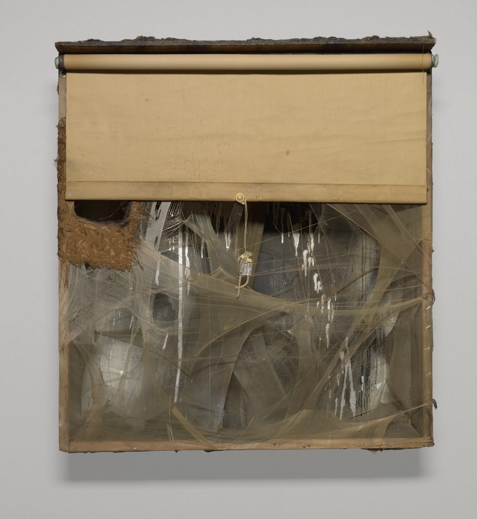
SPIDER LADY NEST, 1959; Wood box with aluminum paint, spray paint, window shade, nylon, thread, fabric, fur, lead customs seal on string, pearl bead, cotton ball, feathers, tassels, and cardboard; 31 x 28 1/2 x 7 in. (78.74 x 72.39 x 17.78 cm); Yale University Art Gallery, New Haven, Connecticut. Richard Brown Baker, BA 1935, Collection; © 2016 Conner Family Trust, San Francisco / Artists Rights Society (ARS), New York.
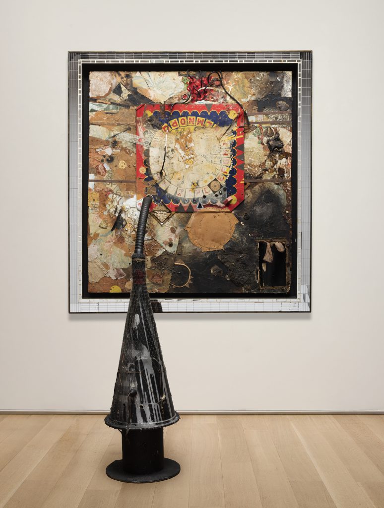
TICK-TOCK JELLY CLOCK COSMOTRON, 1961; wall component: wood, fabric, cardboard, wallpaper, magazine pages, stickers, string, twine, plastic film, glass fragments, mirror fragments, iron straps, grommets, nails, screws, upholstery tacks, metal foil, aluminum sheet, electrical socket, electrical wiring, rubber hose, beads, costume jewelry parts, sequins, ribbon, nylon stocking, cigarette filter, paint, graphite, bitumen, and resin on pressed hardboard; painted wood frame with mirror segments; floor component: wood spool, fiberboard cone, paper, paint, monofilament netting, electrical plug, insulated wire, speaker, audio cable, iron wire, rings and clips, paper, yarn, and twine; 5” reel of half-track monaural tape transferred to digital files; wall component: 57 1/2 × 53 3/4 × 5 in. (146.1 × 136.5 × 12.7 cm); cone: 43 3/4 × 15 in. diameter (111.1 x 38.1 cm diameter); the Art Institute of Chicago, restricted gift of Janss Foundation, Twentieth-Century Purchase Fund; © 2016 Conner Family Trust, San Francisco / Artists Rights Society (ARS), New York.
I think that may be true. MoMA did The Art of Assemblage show in 1961 and Bruce was included, and there’s no question, he was absolutely of the moment in terms of a “zeitgeist” at that time. And of course, he felt that he was being too pigeonholed and that it was too restrictive and so he declared that he was not going to make any more assemblages. That’s actually not strictly true, because some of his punk assemblages from the ’90s are definitely assemblages, he just didn’t call them assemblages.
Yeah, those were pretty hardcore. A lot of assemblages can look not exactly the same, but I think you need to be a connoisseur sometimes to distinguish between them. What do you think is a signature Bruce Conner assemblage? Is it his use of materials and the nylons he seems to use to bind most of them together?
They’re gritty and they’re urban. When he was living here “urban renewal” was going on and there were lots of houses being torn down in the Western Addition, meaning there was just lots of material available to him, so part of it was just availability, but I think it was also a sense of the cast-offs of our culture, the things that were being “thrown out” that were being devalued. He had an intrinsic visual interest in this material, but also was attracted to it because it symbolized outcasts.
J. Hoberman in the New York Review of Books mentions that CHILD, which I guess is the shocker or crowd-pleaser assemblage, however you prefer to see it, has never been shown at MoMA before, even though it’s in their collection. Do you think it’s significant or just a coincidence that the work that he made in 1959 in response to the sentencing of death-row inmate Caryl Chessman has never been displayed?
It’s significant. Every museum in New York was interested in presenting this show, but because Bruce has had this long history with MoMA, and also because of their interest, we felt it was an occasion to re-address CHILD, which was a very important work very early on in his career and had significance here on the West Coast, as Chessman was from Los Angeles. Peter Selz awarded it a prize in a local art show that he juried in 1960, and then it was acquired by Philip Johnson, who gave it to MoMA in, I think, 1970. MoMA felt that this history gave them a real leverage, a jumping off point to really look at CHILD, which had been deemed “unexhibitable” because of its deteriorating condition, and to consider it again. We had a study day together in New York to talk about Bruce’s attitude toward conservation and the continuity of his work and its restoration, and also whether it was even feasible or desirable to try to resurrect CHILD. We concluded it was, and one of the sculpture conservators, Roger Griffith, took it on as a personal cause—for him it was a personal, professional challenge, but also I think moral, and about the museum and its relationship to Bruce. He felt like this could be done and had to be done. What he’s achieved is just a marvel. It’s also a tribute to the techniques that have developed in conservation work and that wouldn’t have been available 20 years ago.
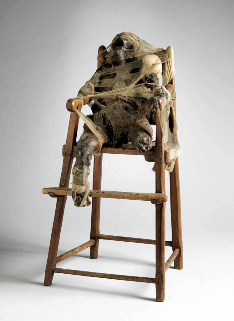
CHILD, 1959; wax, nylon, fabric, metal, twine, and wood high chair; 34 5/8 × 17 × 16 1/2 in. (88 × 43.2 × 41.9 cm); the Museum of Modern Art, New York, gift of Philip Johnson; © 2016 Conner Family Trust, San Francisco / Artists Rights Society (ARS), New York.
You mentioned before that even after Conner stopped making work, he would remake older works, and I saw that Michelle Barger, SFMOMA’s Head of Objects Conservation, had an essay in the catalog. I didn’t have a chance to read it, but I understood that there was something going on with the stability of his work. I’m intrigued that he was actually involved in conversations about the future of the work.
Yeah, but he was also ambivalent about his relationships to museums so I think he felt he could continually revise the work.
I get that and it makes total sense. Although it’s just not possible after you’re dead.
He felt that his work was alive, you know? I’ve been very interested in the comparisons that one could make with Dieter Roth—the Swiss-German artist—and Conner, and the similar kinds of issues their work provokes around material and conservation and decay.
That’s a super interesting point. I hadn’t even thought about that when I was thinking about synergies with other artists, but I like that, Gary. The thing that you made me think about when you were mentioning his ambivalent relationship with institutions was this real strand of institutional critique, if you will, that runs through his work. It’s sometimes expressed really gently and kind of humorously. There was an image that caught my eye in the catalog of the PLEASE TOUCH card that enables the bearer “to touch or alter any collage or assemblage.” He made that in 1963 and that’s an early date to be challenging the institution in this way, isn’t it?
Yeah, but again, if you look at Fluxus, you will see very parallel things around the same time, but I don’t know that Bruce was aware of Fluxus really.
I think of Fluxus as being outside the institution—
It was.
And this feels like it was intended to be inside. I got the sense the card was supposed to be on display, so it was quite a radical gesture, maybe also tying back to this notion of him being the only person who had the right to alter his work. Perhaps he was also kind of challenging himself on that level and trying to open up his process?
Yes and no. The work called DARK BROWN, that came into the museum’s collection in 1961, was a painting he had made and given to Michael McClure, who was a very close friend and associate. Michael needed money so he sold it to a collector here in San Francisco named Harold Zellerbach, and Zellerbach gave it to the museum in 1961. It was the only work in the museum that had a sign on it that said “Do Not Touch.” Bruce had made that piece for McClure because he knew he liked to touch paintings and works. He put a fur frame around it so it would be enticing to touch, and he built it up with many layers, and he knew that those layers would be revealed over time through the process of touching. That was his intention for that piece—that it would have an ongoing life as a painting because of its interaction with people touching it. And of course, generally the idea of the museum is that it preserves an object’s original identity. So there’s always been a question of to what extent the artist can alter a work. I think there’s been a lot of change in museum attitudes and practices in the last 50 years—and it’s a huge discussion among art conservators— about what extent an artist should continue to work on a piece once it’s in a collection. I feel really great that our conservators are deeply, deeply engaged with artists to try to understand their intent and to try to be as sympathetic as possible to that when they make decisions about a work’s condition, or future.
SFMOMA is a front-runner in terms of liberated conservation practices.
It is, and in terms of relationships with artists.
You’re one of the first institutions to start recording artists’ wishes for their works, right?
Yes, and in regards to looking at the materials they use and meeting with artists to talk about those materials. We have a big materials archive. I think the Whitney has also been way up in front on this, too. The Getty actually had a symposium— it was probably in 2008—around the issue of stability or instability or stopping time. It’s a subject that’s been at the forefront of conservators’ and museums’ considerations for the last 10 years, certainly, if not longer.
Can we talk about Bruce Conner and women? I’d be remiss if I didn’t. In some ways I’m probably the perfect audience because I’m coming at this from a quite naïve, uninformed way, so to me he seems to be very in touch with his feminine side, and to really embrace the female, and women. So I read with interest in the Financial Times, Ariella Budick’s review claiming that Conner embraced the femme fatale myth of the late nineteenth century and suggesting that the feminist upswelling in the ’60s left him deeply unsettled, and that with his works around women he was “exploiting the vengeful sex goddess” theme. Budick also says that MoMA tries to frame that tactic as a critique of perverse eroticism, but she’s not buying it. What do you make of that, and do you buy it?
Well, in the catalog we’ve definitely tried to get a woman’s point of view about Bruce’s relationship to female imagery. I think in a lot of his work he was critiquing norms in our culture, our society, and exposing and revealing those kind of normative ways of thinking and seeing. This goes back to de Kooning. Did he have a hatred of women? Was Bruce operating through critique or was it something about his own relationship with women? It’s probably some of all of the above. I mean, Bruce and Jean Conner got married in 1957 and they remained a very, very close, stalwart couple until his death. But Bruce was also infamous for the relationships he had with many other women.
Platonic friendships?
No, love, sexual relationships, infatuations, whatever. He clearly loved women, and women loved him, and many women remained devoted to him over long periods of time even after the relationship had ceased. And I don’t know what his relationship was with musician Toni Basil, but she was the one who in the late ’70s introduced him to the punk scene in San Francisco. Women were very important to Bruce!
But not in a Pierre Molinier or Hans Bellmer kind of way.
No, not at all. One of his very, very last films—of course, all these films are recycled and remade—is called EASTER MORNING, and I don’t know if you’ve ever had a chance to see it but it is the most beautiful, moving, lovely, adoring image of a nude young woman and it’s the epitome of the idealization of beauty, and spiritual purity. It was made in 2008, and it’s a remake of earlier material going back to the ’60s. We will have that film in one of the galleries in the museum, and actually it’s the last film in MoMA. It’s the very last thing you see before you leave the exhibition.
I’ll make sure to try to see to before I talk to Rudolf. A couple more questions if I may—I wanted to ask you about the layout of the catalog, or the decision to use the chronology by Rachel Federman, to structure or to frame the plate sections.
That’s a way to integrate the work, rather than segregating it. We felt it was very, very important to be tracing the life and the work in tandem.
I think it works very well; I enjoyed it. You have to stay quite focused though, because it is interrupted here and there by people, mainly artists, reminiscing about Conner or giving their impressions of his work, which I loved, because they are very personal impressions and they add to a sense of oral history. Did you all think about the catalog together, or was there a sole driving force and vision behind what needed to be in there?
We thought about it all together, but Rudolf and I made a lot of the final decisions and we worked pretty closely with our catalog designer and our publications department. We have a wonderful publications department and Kari Dahlgren, the head of it, is just fantastic, so it was a very collaborative process.
When I was looking at the images in the catalog, I was thinking, as I always do when I look at images, of what they remind me of in terms of other artists. So before I even read that this was a “thing” I felt that the collages were pretty much Max Ernst inspired.
They are, there’s no question.
And then Dada came to mind, and Kienholz, Cornell, the surrealists, and Goya, and I read that William Blake was an influence in your essay—but were there any people that Conner was particularly inspired by or referred to, or was he an artist who really got inspiration not from other artists, but more from life?
I would say both. He was very aware of art and art history from the very early days when still in high school in Wichita. When he and Michael McClure went to New York in the ’50s, McClure called up Robert Motherwell out of the blue and asked if they could visit. Motherwell invited them to go to his studio and see his work, and what he collected. So they were, Bruce was, very, very aware of other artists and what was going on in the art world. In that way he’s not an outsider, he’s not naive. But he was also influenced by things that were outside of art—like this crazy book that his grandfather had and that he pored over when he was still in Wichita, by a guy named Manly P. Hall. It’s called The Secret Teachings of All Ages, and it’s filled with visual imagery from other cultures. And he was very familiar with Masonic imagery. So he was looking at popular culture, he was looking at art history, but he was also looking at the world around him, at what’s going on in the here and now.
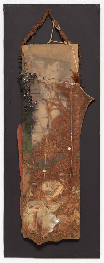
BLACK DAHLIA, 1960; cut and pasted printed papers, feather, fabric, rubber tubing, razor blade, nails, tobacco, sequins, string, shell, and paint encased in nylon stocking over wood; 26 3/4 × 10 3/4 × 2 3/4 in. (68 × 27.3 × 7 cm); the Museum of Modern Art, New York, purchase; © 2016 Conner Family Trust, San Francisco / Artists Rights Society (ARS), New York
I think it’s your joint intro with Rudolf in the catalog where you quote Giorgio Agamben’s definition of the contemporary, which I think is really apt.
Yes, that was Rudolf and yeah, it’s perfect.
It is perfect. The focus is on Agamben’s argument that the contemporary “holds his gaze on his own time so as to perceive not its light, but rather its darkness.” Agamben goes on to say that the contemporary is always the person who’s slightly out of time, as it were, who stands outside of time, and is able to observe it, and whose observations might not be recognized at that moment because of this fact, but who later on will be proven to have been truly contemporary. It seems like Conner is a very happy kind of illustration of Agamben’s definition of contemporary. But then I wondered, as I was thinking about this, about the fact that much is made of Conner’s subjectivity, his emotionality—how do we trust the contemporary who is so bewildered by so much that he sees, or who’s having the identity crisis that he portrays in the ANGELS, or who wants to leave the art world?
I wouldn’t use the term bewildered. I think he was—
Too deliberate and too intelligent to be bewildered.
Yeah, I mean keenly, obviously intelligent, and again, nothing was off-limits. There was no thought, no pocket of experience that was off-limits.
All right, Gary, I’m going to end with a really cheesy question, but I really want to know—what’s your favorite Bruce Conner work?
No, the question is, “which Bruce Conner?”
Okay, you can take one work from the show home, which is it?
Well, for me it would probably be 23 KENWOOD AVENUE, partially because I was able to buy that for MoMA in New York. It’s like the underpinning, it’s the coalescence of drawing as a medium that became fundamentally important. For me it’s the most fully realized drawing, maybe the first fully mature drawing; it’s all there. It’s about as complete and perfect a drawing as Conner ever made, and it embodies almost all aspects of his work. I could take it home and put it on my wall and live with it.