I know you came out to California, specifically Santa Cruz, from Oklahoma with your family a few times beginning in 1949, but it seems that perhaps when you drove out here in 1956 in your 1950 Ford Club Coupe to go to art school is when California really bit you.
It was a four-door sedan and I came out here with my friend Mason Williams who wanted to be an insurance actuary and go to school out here, and I wanted to go to art school. So that’s how it started. I wanted originally to go to Art Center School, but their quota was filled so I had to go to this second choice, Chouinard.
Which is now CalArts.
Yes, and Chouinard turns out to be the bohemian school. Art Center School had a dress code. You couldn’t have any facial hair, you couldn’t have especially long hair, you couldn’t wear sandals or wear a beret, or you know, have any affectations of a beatnik; I think they were trying to snip that in the bud. So then I thought maybe my being forced into this other school is going to do me some good. Art Center School had industrial design and all of that appealed to me, but finally Chouinard turned out to be better.
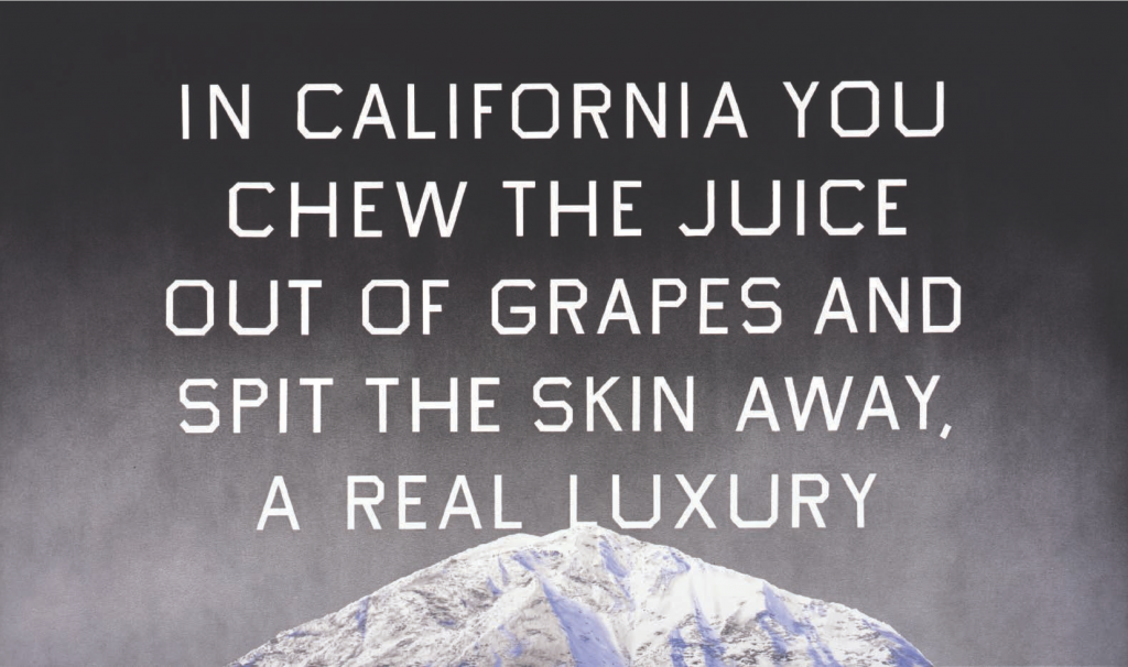
California Grape Skins, 2009. Acrylic on canvas, 38 x 64 inches. © Ed Ruscha.
But didn’t Chouinard still have that kind of aspect of being connected with Walt Disney? So your intention was still perhaps to learn about more commercial work in the beginning, but then perhaps the scene kind of took over in your thinking?
Yes, I had this thought that I was going to be a sign painter or something similar to that. Along the trail I took an advertising design course, and I took editing design and fine arts courses, painting, drawing, all that kind of stuff, and I eventually drifted toward fine arts. I had some pretty good instructors there, but I think I learned more from the people I went to school with. There was a competitive spirit going on there; I picked up on that and that seemed to really have an effect on me. So I was lucky to go to school with a bunch of students who were like-minded.
I’m going to pull a quote from your Smithsonian interview with Paul Karlstrom: “I didn’t listen to Elvis Presley anymore. I became a serious person. I stopped going to church. The move to California was the big change.”
Yes, I’d say that. There was a period of time when I was not keeping tabs on geopolitical events of the day, so you might say I dropped out. I missed a lot of pop culture. I liked Elvis, I just didn’t listen to any music. And if I did it was mostly classical music. And I had no TV so I didn’t know what Gunsmoke was—all these programs that were on the air, I never saw them. So I had a period of time, like four years there, where I just was kind of out of public culture.
So a very different cultural experience than your contemporaries. So during this time too you started to get turned on to Duchamp and Jasper Johns, like Target With Four Faces (1958), and you said Rauschenberg, his “combines,” and de Kooning—were these some of the artists in this kind of incubator period that really started to turn you on to some new stuff?
Yes, and I saw a couple of exhibits of, like, Kurt Schwitters who did little collages. I really liked his work, he was a Dadaist and that was fascinating to me. As was Giorgio Morandi, the Italian painter. And Duchamp, he had a very mysterious, quizzical, airy type of approach to making art, and a lot of my friends, we all sort of admired Duchamp because he decided out loud to quit painting and spend the rest of his life playing chess. We thought: How great could that be? You can’t beat that. Because once you’re dedicated you’re supposed to stick with it, and here was somebody who was not going to stick with it; he finally ended up redeeming himself even though he didn’t make much art the rest of his life, but turned out to be quite a fascinating and educational person.
Definitely. It seems like you were looking at both abstract expressionist artists and also this new style that was more impersonal and ambiguous, perhaps more like works like Target With Four Faces by Jasper Johns. Was there an influential battle in your mind, on your work, and then you ended up drifting—
Well, the prevailing attitude when I was in school was abstract expressionism, and especially the New York School. It was hot and new things were coming out from these people and we all knew about Jackson Pollock, so it was kind of a new world. It was popping through almost everywhere, this art activity from New York City. We got in at school, and so abstract expressionism was the thing, and action painting, and facing a blind canvas was the deal, and we all respected it and practiced it. So you had these other artists like Jasper Johns, who came through and started making things that were hard-edged and symmetrical and with subject matter, so it was a totally different thing. I was greatly touched by those things. Rauschenberg and a lot of other artists began to emerge on this. So that’s really where I got my feeling of it—so I came up with the idea to approach painting as though it were something that needed to be thought out in advance. You conceived the imagery, and then planned it out and executed it. So it was the opposite of action painting, but there were still elements in it that were similar.
After you graduated you took a trip to Europe for about 10 months during which you spent a lot of time in Paris, where you made your first paintings with words . . . or did you start that in school as well?
Yes. I was doing that and I was traveling and I carried a little painting kit with me where I would do these word paintings in hotel rooms, and that kind of moved me, got me going—and being in Europe, I didn’t see much beyond classical art and older art. I didn’t see too many contemporary things that turned me on, but experiencing Europe was an eye-opener, and I felt like I was really getting some work done at the same time. I came back through New York and I went by Leo Castelli gallery and showed Leo my paintings. He was supportive and said maybe we’ll do something together. So about 15 years later I had a show with him. That kind of got me going, and when I got back to L.A. I had to support myself so I worked at an advertising agency doing the layouts and I had to go through a sort of fruitless period doing that so I could get back to painting signs. I wanted to paint signs, not necessarily hamburger signs, not necessarily watermelon signs, but ones that were on canvas, like art signs. And all my friends that were painters, we all wanted to make something that would just blow your hair back, so there was a kind of engine going on. You jump on there, you make your art and that’s what it is. That’s how it pretty much got going.
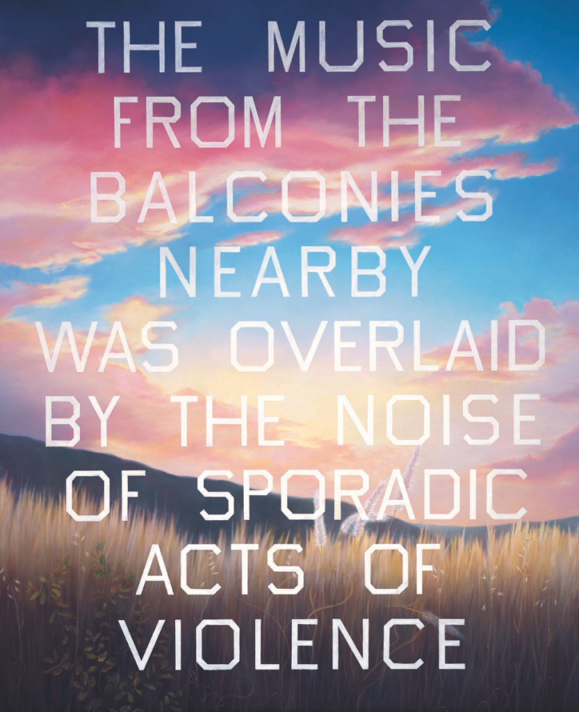
The Music from the Balconies, 1984. Oil on canvas, 99 x 81 inches. © Ed Ruscha.
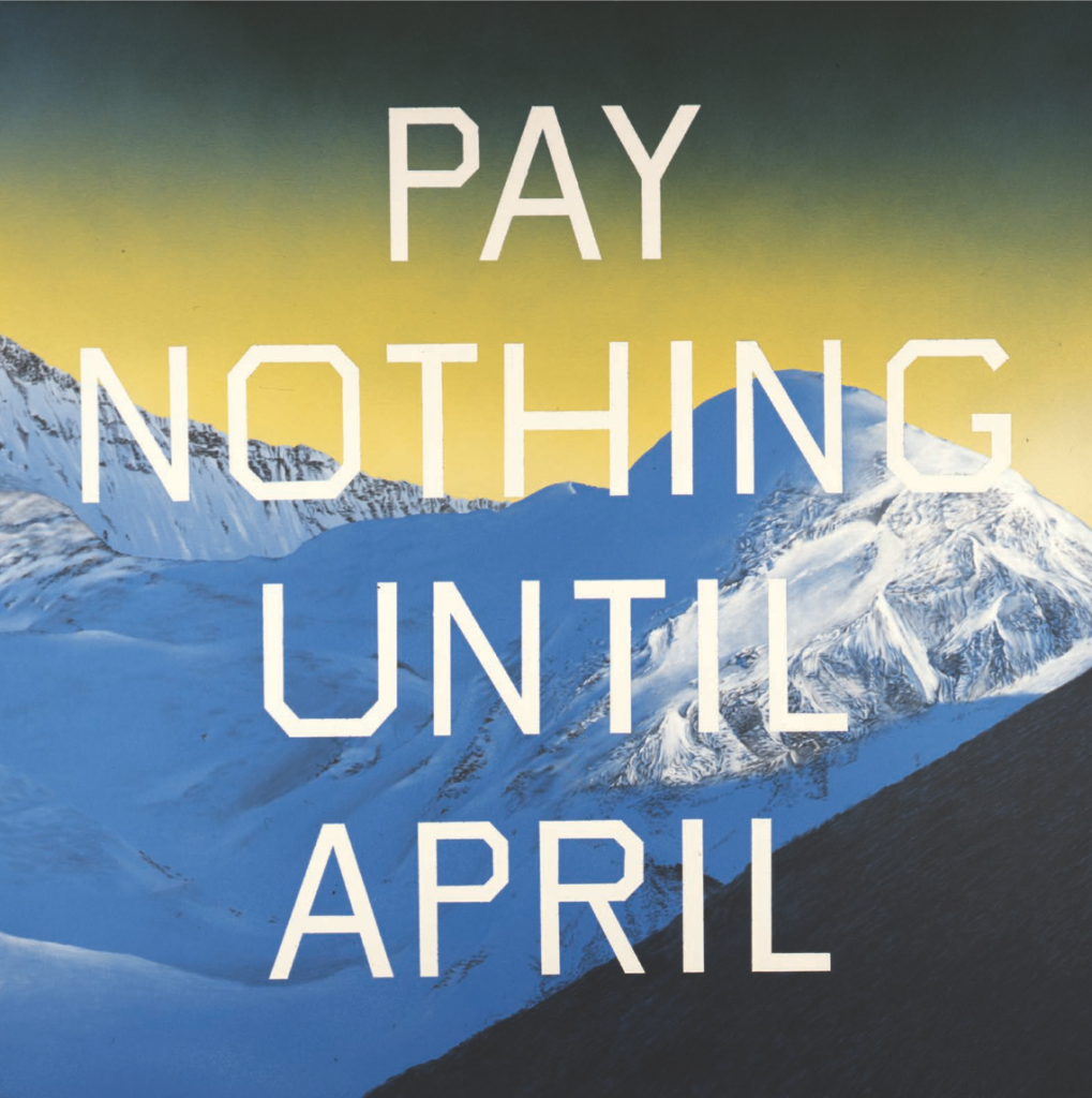
Pay Nothing Until April, 2003. Acrylic on canvas, 60 x 60 inches. © Ed Ruscha.
It seems like you had this moment perhaps, when you were in New York, thinking about staying out there, and then you realized—again an interesting quote that I found—that you “would have been chewed up by the whole machine.” So did you consider staying in New York at this point?
No, not really, but every artist really thinks about that at some point and toys with it, and sometimes it becomes impossible, like it was very expensive at that time to live in New York for someone like myself, so I thought well it’s a little easier in California. You can move a two-by-four across town very easily, and you can’t do that so much in New York.
Yes, I think that’s still very true. And also there’s—well Castelli showed you a Lichtenstein painting of a tennis shoe that had a very big impact on you. Is that also because it was just a straight painting of a tennis shoe? Would you relate that to wanting to just make sign paintings in a sense?
No, not in that sense. There was something subversive looking about this tennis shoe painting. It was done by Roy Lichtenstein who was basically an unknown artist then, but there was something almost cartoony and disrespectful about it, and something kind of nervy about it that I really liked. And then finally the thing just became profound because it was like we were laughing at ourselves. This guy and his art for the rest of his life was showing us how to laugh at ourselves. He introduced an element to my way of thinking that was very inspirational.
Got it. So you’re back in LA, you’re hanging out at Barney’s Beanery, you’re also hanging out at Ferus Gallery at this time too? That’s kind of when it first started—
Yeah, the Ferus Gallery—it was the foremost avant-garde art gallery in the city. There were a couple, or three, other galleries, but they didn’t have the magic that this gallery had. They had artists that were very entertaining and constantly coming up with new ideas—they all seemed to be part of a club almost, yet they were all working in different disciplines. You had Ed Kienholz, Billy Al Bengston, Ed Moses, Larry Bell, Robert Irwin, John Mason, and all these people were doing completely different types of work, and it was inspiring and it was in this flashy city of Hollywood with all its sparkle and swank. So at that time back then—I almost felt like before I was living in some kind of 1950s scratchy black and white movie. And then enter this guy that I met named Walter Hopps who was almost a legend when I met him. He was a curator, he was part of Ferus Gallery, but he was very erudite and earthy at the same time, and he affected all the artists. All the artists loved him. He gave Duchamp his first one-man show at the Pasadena Art Museum so he was crucial to the kind of transition between the artist and the public. He was able to talk to art collectors and make sense out of things. He was connected and he was erudite, and he was a rascal at the same time. Never showing up on time, being unreliable, but finally delivered what his mission was, you know. So we loved him for that.
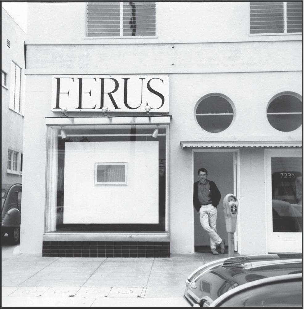
Ed Ruscha in front of Ferus Gallery, 1963. © Ed Ruscha.
You did two shows when he was at Ferus, and then the first show at the Pasadena Art Museum was the pop show?
He did a show called the New Paintings of Common Objects, which included myself and about seven or eight other artists. Jim Dine, Joe Goode, Andy Warhol—I wonder why Rosenquist wasn’t in there, but he wasn’t. Anyway—you know, it was titled that because the word “pop art” wasn’t even invented yet. So that was his way of saying pop art: new paintings of common objects.
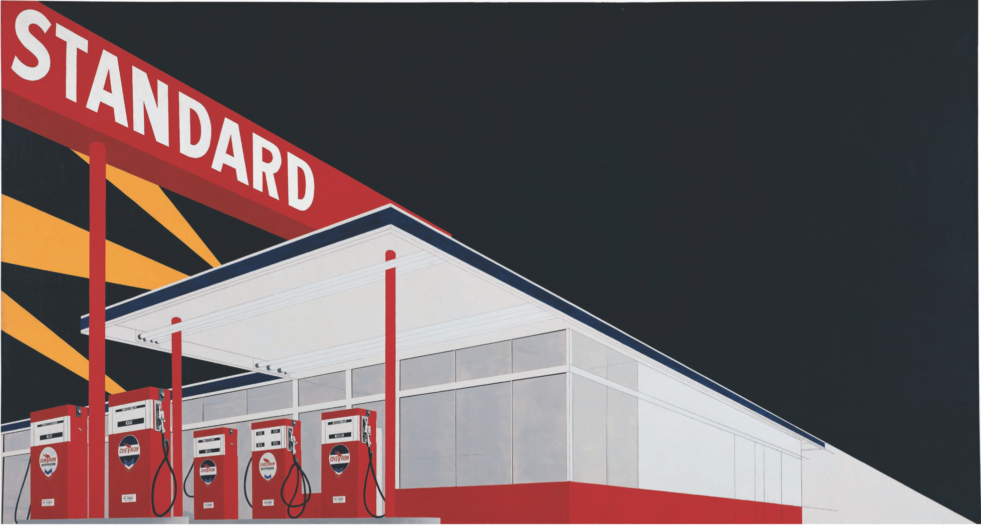
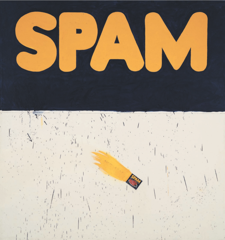
Let’s jump back to your two shows at Ferus. I believe at the first show you showed Box Smashed Flat (1961) and Actual Size (1962)? And for the second one you showed the Large Trademark with Eight Spotlights (1962) and then Standard Station, Amarillo Texas (1963)?
Yes. Those paintings all related to one another and the word paintings were there—those things were kind of based on little noise words, words that related to noise and speed, and things like that. Even the word “spam” sounds like a gun going off, and I was kind of wrapped up in that spirit.
Actual Size, 1962. Oil on canvas, 71 3/4 x 67 inches. © Ed Ruscha.
You mean of looking at words as sounds?
Yes. I sort of concentrated on monosyllabic words, utterings, “pow”—things that come from comic books. All those kind of words appeal to me, and other words too. I always like the word “ace”, and that was always a humorous sort of thing connected to comics somehow, and I just felt like that was the territory I was working in.
You’ve mentioned you were looking at a lot of Dick Tracy comics in high school and that your first experience with art was watching someone draw comic book-related drawings. You have this quote about watching the ink dry and how that had a big impact—can you talk about those influences at all? Because comics also show up later in your work, you actually paint the comics as this almost surrealist element, like cheap westerns in your painting.
A lot of those things were afterthoughts or like a coda in musical composition. The comic at the edge of a canvas, like it was just thrown in as the very last thing, at the edge of a canvas, ready to fall out, was my statement about that.
During this time your “lazy zoom” is starting to appear. This forced perspective, cutting the camera in half—it’s related to film and CinemaScope, and also related to you driving down the freeway and taking photographs of these gas stations as things whiz by. I’m interested in how you were thinking about “lazy zoom” at this time.
I suppose that I wanted somehow—unconsciously—to combine the idea of speed and a gas station all in the same picture, and those paintings would be lower right hand. The upper left hand zoom factor came from movies where you would see a train coming into the scene and it was always tiny in the distance and then in a matter of three seconds it would fill the screen and roar by. I always liked that. That’s that sort of roar that I wanted out of it. It had to have implied noise.
That’s also related to the idea of these words having built-in noise or vibrant energy as well.
Yeah, and then I was painting words for so long I wondered, why am I doing this? I didn’t know why I was doing it—I had done it for so long I forgot why I was doing it. And I liked that too. But then I thought—am I painting pictures of words or am I painting pictures with words? And the question is always out there, and I’m glad I don’t understand it.
You’ve said that words have a temperature . . . I’ve made these notations about things you’ve said about words, and it’s definitely some interesting stuff. There’s a quote from the late ’80s that reads, “Words without thoughts never to heaven go,” which I find really interesting.
That’s from Hamlet. I used that in a library commission I did for a public library in Miami. I thought I could never improve on that combination of words, especially for a library. At the same time, absurdity and enigmas and paradox—all these sort of things that suggest illogic—appeal to me. Somehow it comes out in my work.
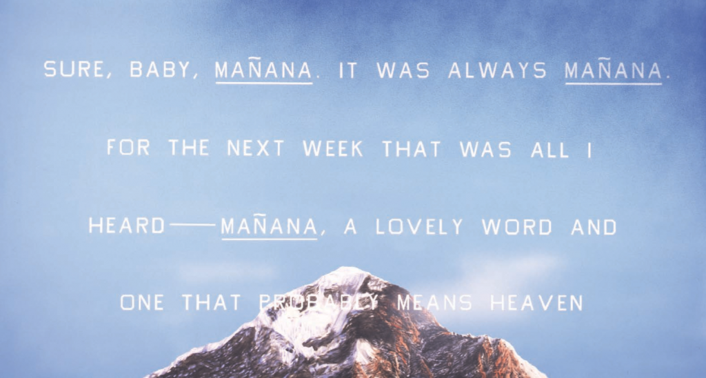
Manaña, 2009. Acrylic on canvas, 38.75 x 72 inches. © Ed Ruscha.
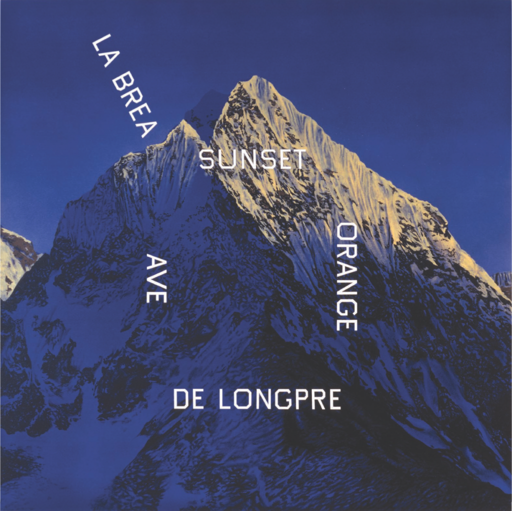
La Brea, Sunset, Orange, De Longpre, 1999. Acrylic on canvas, 60 x 60 inches. © Ed Ruscha.
Yeah, definitely, like Jar of Olives Falling (1969), this surrealist aspect comes and goes. For the pop art show we were talking about, you dictated the show poster over the phone to a commercial printer?
Our backs were at the wall and we had no time to make a poster and think about it so we were at the Pasadena Museum with Walter and he said, “Why don’t we just call them in?” And so that was it. I called up this place called Majestic Poster Press and they did circus posters, boxing posters, that sort of thing, and we just gave them the copy and I told them to make it loud. I liked the idea of remote control creation. You don’t often have that opportunity to do that. Sometimes you’re given too much time to think about something and you dwindle and dawdle with it and never get anything really good, and so in this case it was spontaneous, it was quick, and somebody else made it, and it ended up being a beautiful poster.
So with this idea of being spontaneous and having to put stuff out there very quickly . . . during this whole time, even when you were in college and then in Europe, you were photographing a lot. Photography has always been a big part of your career, but it first shows up as studies and with your artist books, artist publications, before you bring it into other contexts. Obviously first was your 1963 book TWENTY SIX GASOLINE STATIONS. Was that a way for you to do something on the fly without having to spend more time on it, than an actual painting or drawing?
I knew at the time that it was kind of a sideways jump away from painting and I felt like it was a risky thing for me to do and call it my art, but I definitely felt like the book was a piece of art. It was something new for me, but at the same time I had been influenced by book design, and I loved the idea of a book being thought of as a work of art. You look throughout history and it has been considered art, artists painted pages in books for centuries. I felt like, “This is dry, nobody is doing this, nobody is making a book into a piece of art,” so that got me going and I thought, “I need to make a book, but I don’t know what it’s going to be about,” and I almost needed an excuse to make a book. So the excuse is, possibly, these photographs I took of gas stations, and it just went from there.
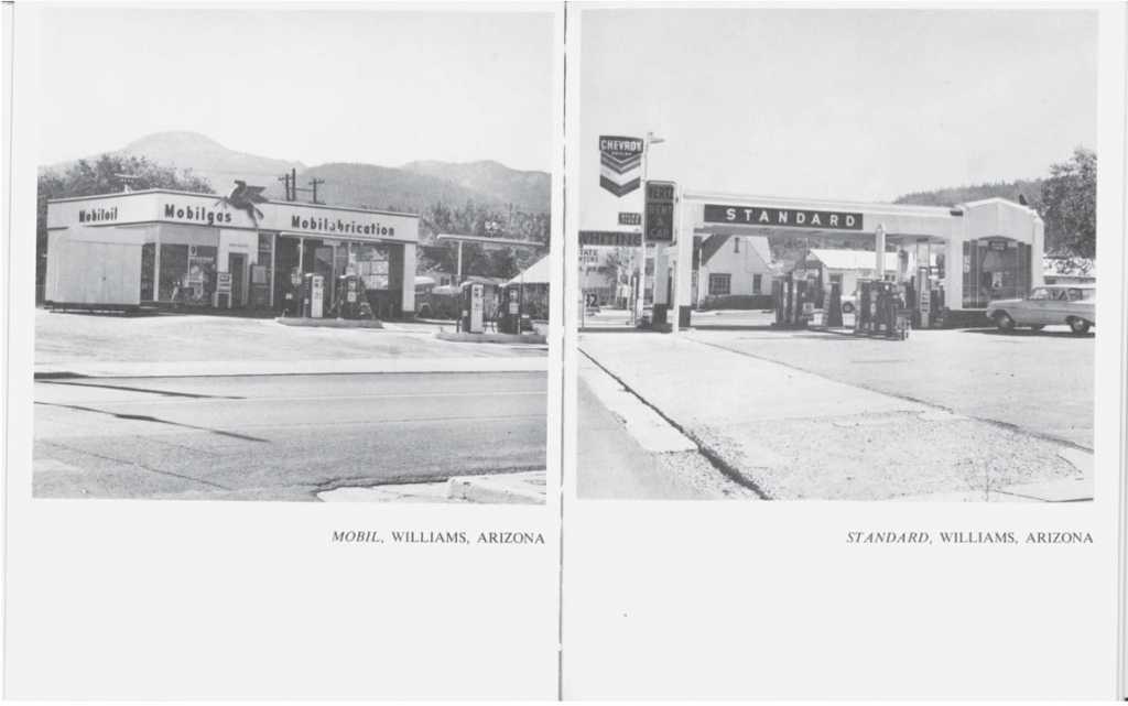
TWENTY SIX GASOLINE STATIONS, 1962. © Ed Ruscha. Courtesy of the artist and Gagosian Gallery.
Did you self-publish TWENTY SIX GASOLINE STATIONS? Were you doing all the typesetting too? Or were you working with a printer?
I learned how to set type by hand, and I worked for a printer here—a fine art book printer named Saul Marks—and I got an appreciation for books. I thought, “Well, someday I’ll do my own book, but I don’t know have an idea for one now.” Eventually, doing the photographs and traveling, driving and all that, got me into that groove and I just built on that. I felt like after I did that one book, well, it’s not enough, I’ve got to do another one, and then it just kept happening after that.
Definitely. And then your books THIRTYFOUR PARKING LOTS IN LOS ANGELES (1967) and NINE SWIMMING POOLS AND A BROKEN GLASS (1968), both came from an hour-long helicopter ride, right? In the Smithsonian interview I referenced earlier, you mentioned going to Mexico City in high school and it totally blowing your mind with its architecture. I’m interested in the thought process of that and seeing Los Angeles, which is this crazy grid, from up above . . . seeing the city in this very different way. What about architecture has an influence on you? It seems to show up a lot, not only in your paintings, but in other books, like EVERY BUILDING ON THE SUNSET STRIP (1966) as well.
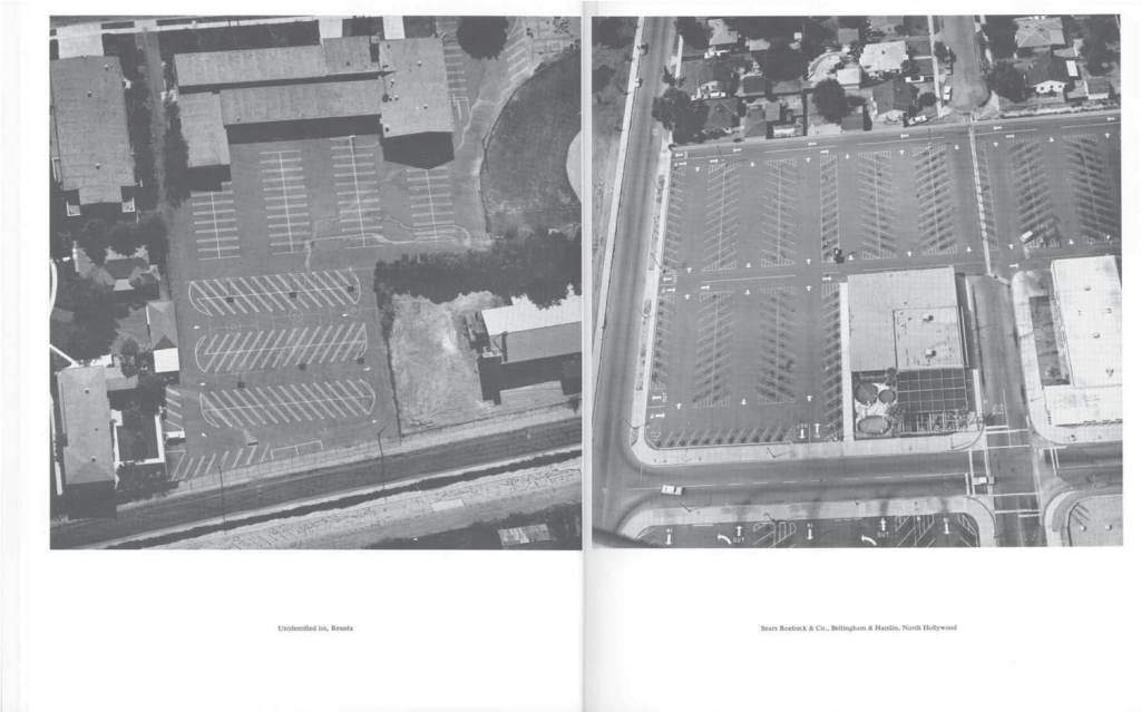
THIRTYFOUR PARKING LOTS, 1967. © Ed Ruscha. Courtesy of the artist and Gagosian Gallery.
So the books, the ones that are just architecture, it was the cultural aspect of it, just my take on what LA was like, and I liked LA, I liked the nostalgia of LA. I think that we can kiss that goodbye now because it’s quickly changing. If you’ve never been there you should see it before it gets swallowed up. It’s turning into a turbocharged theme park. Back then I was concentrating on having an assignment, a self-assigned assignment, and so doing those books were—I don’t know, it was just very fulfilling to do that.
And now those books have influenced zine making, which is all of a sudden back in, and you know, it’s just—it’s nice to see again. When I was at school at the San Francisco Art Institute in the photo department, seeing those early books really turned me on to thinking about photography in a more conceptual way. These books have had a big influence on a lot of people: at your show in New York, Ed Ruscha Books & Co., it was fascinating to see how these books have influenced other generations of artists.
Maybe along the way there I sort of wound down making books, but I still keep that door open. I might have a few thoughts on the refrigerator, and at some point I’ll jump back on it and do something, but I had that run and it was a good run while I was at it.
Let’s talk about your use of alternative materials that show up in your paintings, and I believe sometimes in your prints as well. Perhaps the first one you did was the Stains portfolio, from 1969. What turned you onto that?
I think I was becoming fatigued by the idea of putting a skin on canvas with oil paint, and it seemed to me like maybe there are some other things that I could use in place of the oil paint. So I began to play around with these various materials. I could see that they were staining the canvas, so it became a process of staining rather than painting. It was a new frontier, as temporary as it was, and it only lasted a few years, but it was just sort of a side exercise that I wanted to get into.
How does a work like Dance? from 1973 fit in—I mean using cheddar cheese, ketchup and mustard, that’s all pretty crazy.
I didn’t actually use cheddar cheese to make imagery with, but I did images of cheddar cheese to illustrate cheddar cheese as though they were objects in a picture.
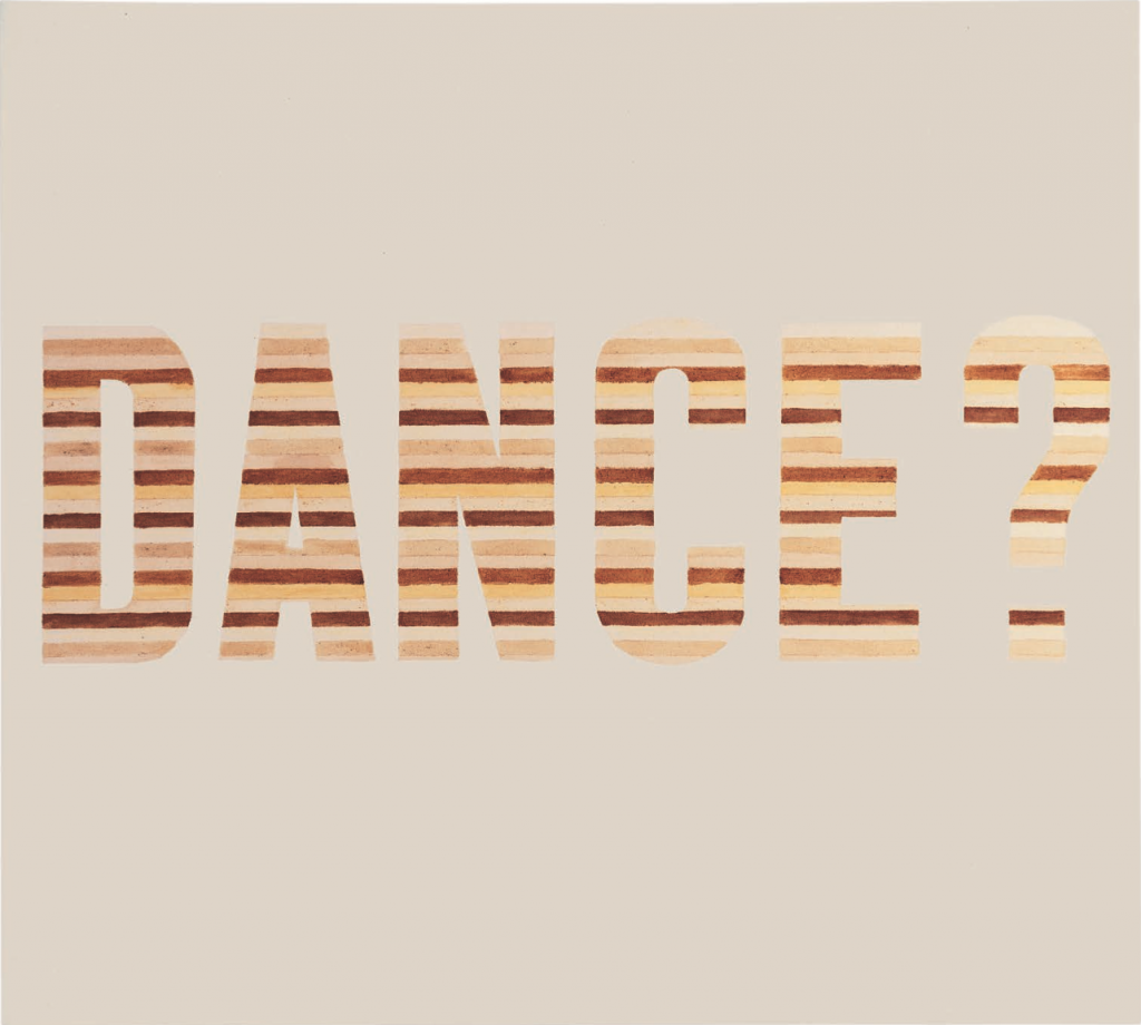
Dance?, 1973. Organic substances on raw canvas, 54 x 60 inches. © Ed Ruscha.
In 1970 at the Venice Biennale you did the Chocolate Room.
That was kind of a spin-off of things I was doing in London, and I did a portfolio of silkscreen prints titled News, Mews, Pews, Brews, Stews, Dues. They’re like six different ideas of what I thought England was like. I used various materials, like chocolate and axle grease and caviar and grass clippings—things like that—flowers, anything that would be able to put through a silkscreen and would keep its image and wouldn’t bleed to death or something. I was invited to go down there to the Biennale and so I packed up and took one of my ideas down there and out of it came this chocolate room. The Biennale invitation involved working with a printer who had a silkscreen setup so I thought, this is the opportunity to do this, and that’s how it came together.
So when one entered the room there was a very heavy chocolate smell?
Oh yeah, you were just absorbed by the fragrance of chocolate, and it was very humid there anyway, so it was even twice as fragrant as you might imagine.
Were people picking at it or trying to eat it or anything?
People would lick their fingers and draw on the shingle-size pieces of paper. They would put peace signs and all number of graffiti and things. I didn’t even care, I thought it was fine. It was only going to be up there for a couple of months anyway.
For the Venice Biennale in 1976 you did Vanishing Cream, where you were writing in Vaseline on a black wall?
Yeah, that was done with Vaseline. I don’t even have a picture of that thing, I can’t imagine. I mean, I’m fairly diligent about recording things just for my own observation and interest, and I never got a picture of that, which I’m really sorry for. But it was something that was put up and then when the show was finished it was just dismantled and thrown away.
Something I’ve got to jump back to about books and photography—can you say a couple things about EVERY BUILDING ON THE SUNSET STRIP? What was your process with that?
I like the idea of recording, which I have for a long time, recording the elevation of a phenomenon: in this case it was a street with stores and buildings. It happened to involve this mythical place they call the Sunset Strip, so the whole thing amounts to a string of buildings, and they began to appear to be as though they were almost like a movie set, or it was all façade. I wanted a sort of demographic approach to it, where there’s no agenda, and everything just fits together and you see every building that’s on this stretch of land that runs two and a half miles, and then I did the other side of the street, so that they face each other. I began to look at it as though it was a straight facade of all these buildings.
We should talk about the de Young show for a minute. This whole show is about the West. You’ve said: “I love California style and that’s why I came here.” I’m interested to hear your thoughts on what California style means to you now and what the West means now, versus what it did back then. There was something I read in the ’90s, or maybe it was the early 2000s where you were talking about LA and how much of a circus it’s become, and kind of moving away from what made the West so appealing and beautiful to all the artists and freaks and everyone that used to transcend out here. I know that’s a very big question.
I’ve been all over the US and I have a particular soft spot and a hopeful frontier idea that maybe the western side of the US has offered more delectable subject matter. There is something that appealed to me in traveling out here. It always involved driving a car, so that’s where the gas stations came from, that’s where sunsets came from, and it’s a combination of all kinds of things crushed into something—it’s kind of, I don’t know, crunching gravel, it just involves so many things. The western side of the US has—there’s something—sunrise, sunset, hope for the future, and you know, it’s not oily like the eastern side!
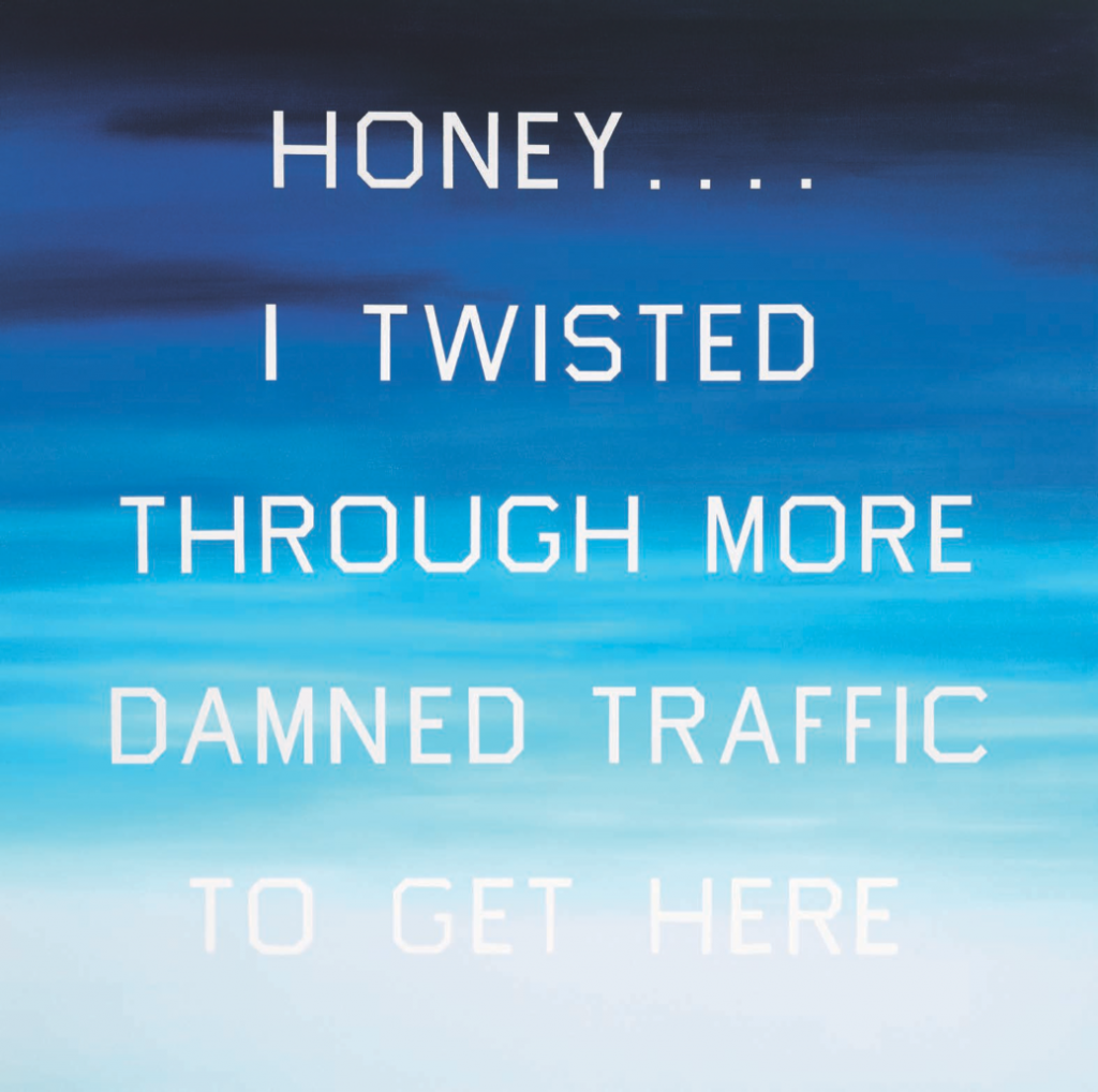
Honey…. I Twisted Through More Damned Traffic To Get Here, 1984. Oil on canvas, 72 x 72 inches. Private collection. Courtesy of the Fine Arts Museums of San Francisco.
In 2013 you joined the SFMOMA board. How did this come about?
When they invited me to be on the board at SFMOMA I jumped at it because I knew I could come and visit, and I’ve always thought—and I’ve thought about this carefully—that San Francisco is the most beautiful city in the world. And I can say that because I think it’s got a mystery to it that hit me when I was a kid and visited there. It still maintains that mystery. Any time I get an opportunity to go to San Francisco I do. And SFMOMA is opening up pretty soon and I think that’s going to be an expansion of the cultural landscape up there.
Even Gagosian is opening up across the street. It seems there’s a lot of change happening, which I hope sticks around.
Just in the last week and a half I curated this exhibit that’s going to be on at Crown Point Press.
You’ve been doing your mountain series since 1998, with both paintings and works on paper. It’s such powerful imagery—
On these works, I imagine a curtain being opened and a mountain image occupies the space akin to a background. On stage and certainly positioned are words or other objects. This would be the show and tell of this kind of picture.
You’ve mentioned that you move around your work stations in your studio to keep things fluid and have a studio in LA as well as in the desert . . . Can you say a few things about your work ritual?
I follow a predictable pattern of spastic, jerky motivations. These are motivations that are puzzling to me to this day. I do not follow astrology but my sign says that I do unimportant things first.
This is also an abstract question in a sense: I know that Walter Hopps, even back in the ’60s, was this kind of mythic curator already, and obviously now in the history books he is this very mythic curator . . . Do you think there can be another figure like Walter? What do you think the West Coast needs?
It sure needs and could use another Walter Hopps, but I don’t see one on the horizon. I mean there are a lot of very smart people out there, but a lot of them are not interested in art. He had this vast approach of understanding the hard side of life, and that’s where he came from. I think it would be great if we could, even if we invent somebody!
It seems to me that you are both a conceptual artist and a pop artist—if there was one movement that you would relate more to, what would that be? I know labels are strange things and I feel like you have rightfully entered into your own space . . . but just curious about your thoughts on if there is a movement you feel best fits your practice.
It’s amusing to see how so called “movements” evolve and dissipate, and how certain artists eventually evade and fly off from their positions in a given movement. Nothing seems absolute but all art seems to be made out of other art. I don’t know where I belong and I’m content that way.
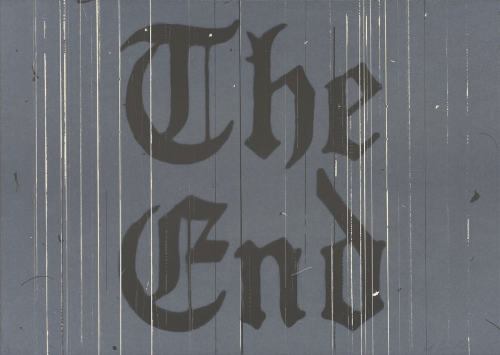
The End, 1991. Color lithograph, image and sheet: 26 1/8 x 36 3/4 inches. Published by the artist. Courtesy of the Fine Arts Museums of San Francisco.